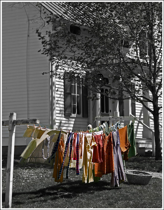
I didn’t vote in the Free Study Challenge so this is the first time I’ve looked at your image. This is one of those images that I hate to critique. The image is extremely sharp and the post processing looks like you accomplished your intent. So why didn’t it score better. I think you were attempting to create a little bit of wow factor using selective desaturation. However, it doesn’t really provide any wow for me. Then again, I don’t think the house in the background looks old enough where going sepia would do the trick either. On top of all that, I think the image looks a little unbalanced with the house overpowering the laundry. Cropping tighter on the laundry might help with that issue. This subject looks like it has a lot of potential but a different perspective/background might be needed.
Overall, the image is good and your score reflects its above average qualities. I glad I had a chance to look at your entry, as I enjoyed the visit.
Feel free to PM me if you have any questions regarding this critique.
Like the vintage style. Too much house, though. A better crop to just focus on the laundry, with a limited amount of background would have worked better.
Says who?!?!? Love this image. I am not entirely sure I like the selective desaturation, although it works in this case. I'm just wondering here, would a sort of desaturation, where you still keep a bit of colour in the clothing, but not as much colour as you have now, maybe work? Sort of like a desaturation but then tone down the colours? I don't know. ~9
Washing has a life of its own! I love the range of colours here and how they stand out from the background. Maybe making the background a little darker could have made it even more appealing.
I think this would be GREAT done in a sepia duotone. For me, the POW of color against the black and white loses the nostalgic touch, particularly with the title. I like the composition.







 Add photograph to your favorites
 Add photographer to your favorites

 Photographer found comment helpful.


