You tried something different with this image and, unfortunately, it didn't resonate with our voters.
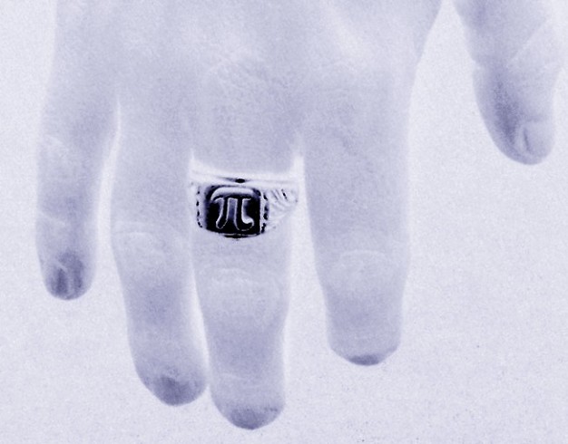
It's an unusual and unique take on the challenge and I commend you for doing it. I do think the contrast could have been boosted a bit to give the hand a little more contrast from the background, and maybe more of the hand could have been in the picture, but these are minor points.
What is important is that you tried something new and different. I think the comment of eqsite is a good one and you can learn a lot from his words.
Interesting effect. I'd like to see more texture and contrast in the hand. Perhaps the original shot did not have interesting lighting, and it still shows here.
This is an interesting image, but there are a few things that don't work well for me. First, because the background has a similar tonal value to the hand, it doesn't stand out as much as it could. Second, the fingers seem a bit foreshortened possible because they were slightly curled in. Finally, the composition doesn't quite work. You get a nice curve from the thumb through the fingers, but then it ends and the eye is forced to jump to the off-center ring. If there was some element that extended the curve around and back to the ring in a spiral, it would not only add a stronger visual element but would also be a stronger tie in to the pi theme of the challenge.
Doesn't seem enough contrast in the fingers. And seems noisy. Did you try working with only one colour channel? I can imagine red-only could have been useful.





 Add photograph to your favorites
 Add photographer to your favorites


 Photographer found comment helpful.


