Hi, from the Critique Club,
Triptych throws up some good photos and tell some good stories.
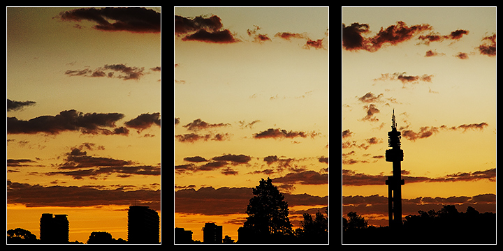
Composition is pleasing, but I feel you missed an opportunity by using a single exposure and dividing it. Perhaps with slight rearranging of the elements it would have worked better.
Technically it is well taken photo with good lighting. The graduated sky looks great and the clouds give it an extra element. The choice of image sizes gives a nice balance with the borders and I think the white line in the borders works.
Overall, I think it slightly misses the true meaning of a Triptych which is usually three individual images combined to make a story. This is why I suggested perhaps moving elements into a different order. The tower element would have been better as the first part and then the other two as they appeared, but this is just my opinion, by doing this it would taken away the obvious fact that this was created from just one exposure. However, I feel it scored at about the right point in the challenge, it is a compotent submission with some nice details. Well done. |





 Add photograph to your favorites
 Add photographer to your favorites

 Photographer found comment helpful.


