had a bunch of options i thought of entering. took this a little later and decided on it.
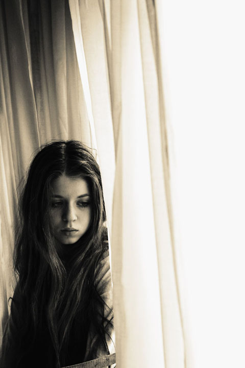
these curtains hang in my dining room.
moved all the furniture and now i never want to put it back.
furnitures' just clutter.
Statistics
Place: 209 out of 573 Avg (all users): 5.8971 Avg (commenters): 7.5000 Avg (participants): 5.7833 Avg (non-participants): 6.1455 Views since voting: 1316 Views during voting: 265 Votes: 175 Comments: 18 Favorites: 5 (view)
You know its a real shame that on this website voters don't recognize thats that are really good. The problem is that the voter as a whole goes for the "classic" crisp image and overlooks portraits or other images that show lots of emotion and moodiness. This is a lovely picture.
I really like this shot on first impressions. I think your lighting is very good here...nearly perfect with the possible exception being a bit too dark on the right eye - but that's really nit picking. I love the shadows captured on the face...quite excellent. I'm not sure how I feel about the long flowing curtains. Something seems off about them. For the most part I like them but as I'm trying to imagine what is going on in the photo I'm left at a bit of a loss at first. After really studying the photo it appears to me that what she is doing is looking out of the curtain to something below on the street (I imagine she's up a floor or too looking down). In retrospect, all of this is excellent because your photo indeed tells a story when I can imagine she's looking at something out the window from a second story window and I'm curious what it is. Unfortunately you have about 2 seconds for the average voter to "get it" and I don't think it is obvious enough at first glance that she is looking out the opened curtain. Doing something to enhance that part would really help. Perhaps open the curtain up a bit more and have more light coming in from that spot directly, lighting up that side of the face. As I'm trying to find something to explain why this shot didn't score better I'm really coming up with a loss here. I really think it's a strong photo. Perhaps the curtains are too wrinkled? Perhaps the model's hair is a tad mussy and out of place which causes a slight distraction. See...nitpicking again. Honestly, I can't explain it. I can tell the photo isn't a top 10 contender but I can't put my finger on it. Sorry about that. Take pride in the fact that you got zero 1's or 2's in voting. I.E. NO ONE thought it sucked. Converserly you got 3 9's and 10's which means some people thought it was fantastic. My biggest form of criticism would simply be that it isn't the strongest photo for a Free Study challenge. As you may well be aware, Free Study encourages the best of the best to come out. You really have to do something over the top to get noticed here. Had this photo been in a weekly challenge such as "Pensive" or something you'd probably be a top 10 contender for sure! Great job, really.
I really like this shot on first impressions. I think your lighting is very good here...nearly perfect with the possible exception being a bit too dark on the right eye - but that's really nit picking. I love the shadows captured on the face...quite excellent. I'm not sure how I feel about the long flowing curtains. Something seems off about them. For the most part I like them but as I'm trying to imagine what is going on in the photo I'm left at a bit of a loss at first. After really studying the photo it appears to me that what she is doing is looking out of the curtain to something below on the street (I imagine she's up a floor or too looking down). In retrospect, all of this is excellent because your photo indeed tells a story when I can imagine she's looking at something out the window from a second story window and I'm curious what it is. Unfortunately you have about 2 seconds for the average voter to "get it" and I don't think it is obvious enough at first glance that she is looking out the opened curtain. Doing something to enhance that part would really help. Perhaps open the curtain up a bit more and have more light coming in from that spot directly, lighting up that side of the face. As I'm trying to find something to explain why this shot didn't score better I'm really coming up with a loss here. I really think it's a strong photo. Perhaps the curtains are too wrinkled? Perhaps the model's hair is a tad mussy and out of place which causes a slight distraction. See...nitpicking again. Honestly, I can't explain it. I can tell the photo isn't a top 10 contender but I can't put my finger on it. Sorry about that. Take pride in the fact that you got zero 1's or 2's in voting. I.E. NO ONE thought it sucked. Converserly you got 3 9's and 10's which means some people thought it was fantastic. My biggest form of criticism would simply be that it isn't the strongest photo for a Free Study challenge. As you may well be aware, Free Study encourages the best of the best to come out. You really have to do something over the top to get noticed here. Had this photo been in a weekly challenge such as "Pensive" or something you'd probably be a top 10 contender for sure! Great job, really.






 Add photograph to your favorites
 Add photographer to your favorites

 Photographer found comment helpful.


