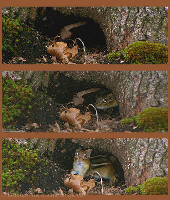
Cute little thing - Has to be said though the flash catchlights in his eyes are distracting and because the flash has been used ontop of the camera or along side it this has made the images look very flat. If you notice your top image has good contrast and nice blacks which is good. This is how the others should have been edited too.
Cute series of shots that work well together. The whole presentation could have been enhanced by a bit of editing... perhaps a contrast or levels adjustment. The top photo looks a bit crisper with more color compared to the other two.
I think if you bumped up the saturation & contrast on this, it would have made the images pop more. The brown background is also a bit distracting. It doesn't really pull any color from the images or enhance them. I think a black or white would have made a big difference. IMHO








 Add photograph to your favorites
 Add photographer to your favorites


 Photographer found comment helpful.


