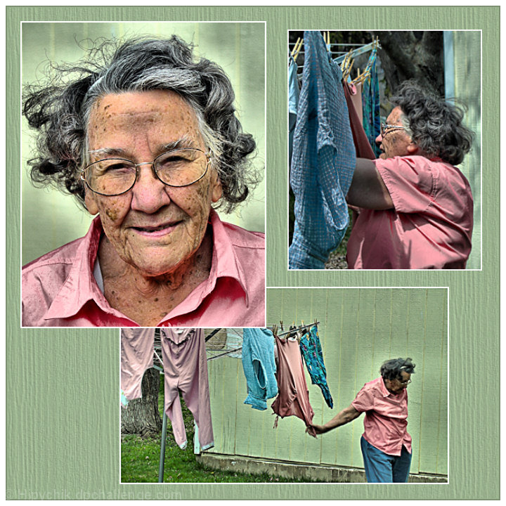
Caught my 93 yr. old neighbor, Katherine, out doing her laundry. She's been doing this for many, many years! She told me she doesn't like to get her picture taken, but she let me take it anyway. Then she asked me to make sure her "underclothes" were not in the shot. :)
Edit: This isn't a 4th photo in the BG. I matched BG color with the photos and added a woodgrain texture.
PS...thanks for all the helpful comments!
Statistics
Place: 53 out of 244 Avg (all users): 6.2120 Avg (commenters): 7.2800 Avg (participants): 5.9792 Avg (non-participants): 6.3967 Views since voting: 1596 Views during voting: 544 Votes: 217 Comments: 40 Favorites: 1 (view)
love the texture of the background. i personally like the processing you used on the top left (because it makes the image pop out of the pastel setting), but there is a dark spot on her forehead. My fave tho is the bottom pic, purely for the candid moment.
The portrait is a knock-out! I hope your neighbor appreciates it. The triptych tells a lot about your neighbor, and I really like the background (canvas) you used from the bottom shot.
dang, i missed voting on this shot. super images, and very well palced in teh frame. i'm not entirely sure about the colour, but that's acutally a small quibble here.
I like the layout (especially the overlap) and the images. I would have liked the image better if the dodging had not be so so heavy handed around the subject. Nice work, though, Terri. Nice work indeed.
I think you have an awesome subject here, and the shots really tell a story. However, I think the post-processing ruins the effect as it makes her look almost cartoonish, and I find myself looking more at the post-processing and less at the pictures.
I think everyone can see their mother or grandmother somewhere in your presentation. With that said you have presented your triptych well and I must bump it up to 10. GREAT WORK!
a potentially great triptych, however the overediting has not helped the shot, but hurt it, imo. the triptych is also made with more than 3 images. much potential..
great images, theres a bit too of halo around her as on the pictures, but in this case, i kind of like it, it adds to the image. The green background makes it a bit plain though. I understand the consept with it, but it makes the pictures to blend it too much
I like the documentary feel to this and the way you arranged the images, but personally I don't care much for the processing, it seems "too much" for me. This could also work well as black and white, I think. You picked a subject most people wouldn't and composed it thoughtfully, apart from the processing issue - 9.
Great set - Love the feel to this but the PP just seems over done too much. Did you use shadows/highlights tool? The main image looks like it has good contrast and highlights but the other two get let down by the lack of contrast and the dodging around the woman on the bottom pic is too much. Having said that i love the feel of the bottom pic - Really natural feel to this - Just let down slightly by the PP
Like the story here quite a bit. The background works very well, too. Halo effect around her head is kind of patchy and unrealistic on my monitor, particularly on the portrait.






 Add photograph to your favorites
 Add photographer to your favorites

 Photographer found comment helpful.


