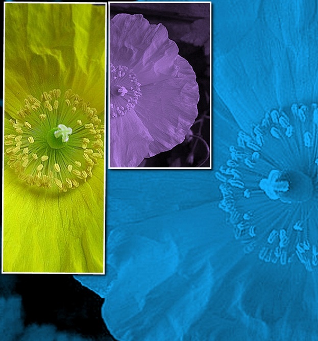
just coz dpc didnt think this rocked in the challenge, doesnt mean its not a good image .. i can just see this in some modern office gracing the wall .. and i reckon the ppl who came into that office would go ... "WOW .. look at that .. awesome man !!!" ..:)
i really like your use of colour and your design is great .....
A little soft in detail but feel it works with the pastel colors your have chosen. Even though I would of liked to see just a bit more sharpness on the center of the flowers. A good example that every picture does not have to be sharp, sharp, and sharper to be good. I like the use of tones.
Or just one poppie, occassionally rotated aand flipped. I do like your presentation of the three images, and the two internal borders. The yellow poppie works best for em. I wonder what the whole would look like if all the images were yellow.




 Add photograph to your favorites
 Add photographer to your favorites

 Photographer found comment helpful.


