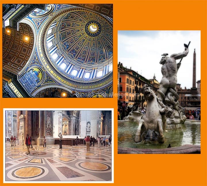
post work:for all the images in rawshooter essentials auto all. for all images levels, curves, rotation and crop, saturation, usm. for the second image image into Saint Peter neat image and skylight filter from nik collection, for the fountain Orton effect with an action that i can submit if need)
Statistics
Place: 104 out of 244 Avg (all users): 5.8785 Avg (commenters): 5.9048 Avg (participants): 5.6364 Avg (non-participants): 6.0870 Views since voting: 784 Views during voting: 342 Votes: 214 Comments: 25 Favorites: 0
Challenge: Meets the challenge, no problems there.
Strong points: Great architecture, beautiful shots of it. The colours in the individual images, especially the two indoor shots, are spectacular, as is the detail in those two shots.
Possible weaknesses: Mainly the presentation. There seems to be a disconnect between the grandeur of the images, and your presentation of them as a group. The orange is a bit on the strong side, the extra white border around the bottom image gives a sense of disconnect, the different treatment for the individual images increases this sense of disconnect.
Technicals: The two indoor shots look to have no technical problems. The light in the shot to the right is more difficult to control.
Overall: I think that what you mainly have here is three beautiful shots that, even though they belong together, are not working together as a unit. They are beautiful by themselves, but put together it is too much. The presentation increases this sense of the images being individual shots rather than a unit or a story.
I hope this helps. If I can be of further help, please let me know.
Nice layout and I really like the two shots on the left, but the one on the right is hard to look at -- overall focus is soft and eye can't tell whether to focus on the statue or the buldings in the background. I would have used a softer background color as well.
individually, the three different shots would be very strong, but as a trypich I'm not sure they're working. they seem to all have different effects applied to them, the shot of the ceiling being the strongest, and the shot of the fountain having some soft-focus effect applied. also, they seem to be rather haphazardly placed on the page, with different framing elements, although I rather like the orange. a bit more consistencey and I think this would be much stronger.
I really like your photos but I don't like the way you have presented them. The orange does nothing for the photos, it is too garish and does not complement the beautiful, historic architecture you have captured. You have a white border around only one of the images, this creates an imbalance.





 Add photograph to your favorites
 Add photographer to your favorites

 Photographer found comment helpful.


