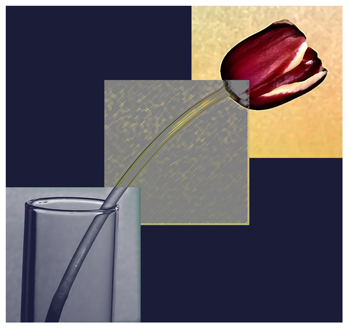
straightend, cropped, levels, saturation, contrast, neon glow filter, dry brush filter, pallett knife filter, background, NI, resize for web
Post Challenge: Thanks for all the nice comments. I wanted to do something outside of the box. Given the rules we are given, I don't think I should have been voted down because I used filters. Yes its artsy and different but I like it and I'm glad most of my commenters did also.
Statistics
Place: 82 out of 244 Avg (all users): 6.0427 Avg (commenters): 7.1905 Avg (participants): 5.6947 Avg (non-participants): 6.3276 Views since voting: 1230 Views during voting: 411 Votes: 211 Comments: 23 Favorites: 3 (view)
Hi Gayle! Funny that I pull your image to comment on.
Well I will first tell you that I voted a 4 on this in challenge. But I was obviously in the minority on this one. This shot didnt grab me. While it easily met the challenge, the filters used were a bit over the top for my tastes. It felt more like a painting than a picture. Now I can see that you were going for somethign maybe a bit more surreal - just not my cup of tea.
That said - the triptych is laid out well. Good use of the overlapping squares to isolate the parts. The colors in the boxes are nice, though I am not sure if there would have been a better background color than the blue. Hard to give you any feedback on any of the technicals of the shot from a focus, detail point of view as your filters covered up most of that detail.
Now looking down at your other comments I can really see that people connected with your image. 22 comments almost all praising the shot is awesome! And your score is a great gauge as well. This might be a good image to post as a print. You could draw some good attention from it.
Hope some of this helps. Keep up the good work and we look forward to seeing you at Hocking Hills!
The picture of the tulip is nice, I just don't care for the filters or whatever it was that you used. I think it takes away from the "photography" of what looks like it was a nice shot.
You're probably getting reamed a bit on your interpretation of triptych, but challenge requirements aside, I really like how you did this. Nice partition of the different effects and good color scheme.
I Love This One!! It may just be my favorite so far. I love how you lined it up perfectly, and how each is the same, yet different! Sorry if it doesn't make sence. I'm up way earlier than usual :)
Great triptych, I love the effect that you have created here outstanding blend of digital photography and digital art which would not look out of place on anyones wall






 Add photograph to your favorites
 Add photographer to your favorites

 Photographer found comment helpful.


