This is a little different then what I usually do. Normally I never do any PP besides contrast, saturation, etc.
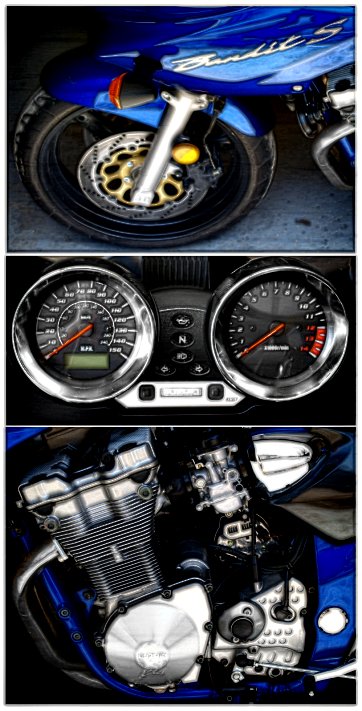
Started w/ 3 images and resized, this step took me the longest to get figured out how to get them to fit together w/o "stretching" one and making it look funky.
I then made some layers and adjusted contrast, some selective desat, blur, edges, and finished w/ unsharp mask.
Overall, I'm pretty pleased with my image and would love feedback!
Statistics
Place: 210 out of 244 Avg (all users): 5.1806 Avg (commenters): 4.6667 Avg (participants): 5.0101 Avg (non-participants): 5.3248 Views since voting: 837 Views during voting: 334 Votes: 216 Comments: 10 Favorites: 0
I didn't vote in this challenge so this is the first look I've had at your image. My first impression is that I like the balance of the three images, as the center image of the gages really help tie the top and bottom images together. However, the three images aren't really that sharp and the top one looks distorted somehow. Reading through the comments you received, many of the voters agreed.
Reading through your process steps I noticed that you intentionally added blur to this image. Was this part of a post processing style you were trying to emulate or an attempt to soften the sharpening artifacts on the engine image?
When I first upgraded my photo editing software to Paint Shop Pro I spent a whole month reprocessing my old images to learn the program. It was the best 30 days away from my camera ever spent. I think you have three very nice images for practicing your post processing skills. I love the composition of these three and hope you will take some time working on them.
Feel free to PM me if you have any questions regarding this critique.





 Add photograph to your favorites
 Add photographer to your favorites

 Photographer found comment helpful.


