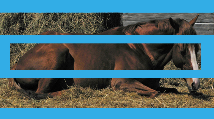
Poor ol' Twinkle. He was castrated about a month ago and still misses his two best friends, with which he sired a beautiful filly (see my hopemage's portfolio pic, buckingbaby).
pp: shadows/highlight, resize, copy, paste, paint save for web
Statistics
Place: 239 out of 244 Avg (all users): 4.0049 Avg (commenters): 3.3429 Avg (participants): 3.8421 Avg (non-participants): 4.1441 Views since voting: 1242 Views during voting: 403 Votes: 206 Comments: 44 Favorites: 0
Gotta say I got a chuckle over your explanation of the "loss". I'm in the "not fond of the blue" camp. It is an interesting and unique way to achieve divisions, but maybe a textured border in a more complimentary tone?
I only gave this a 5 because I didn't understand the point of the large aqua borders. I think the choice of color for the borders hurt more than the size, but still the design didn't seem to have any purpose -- it obscures rather than enhances. Perhaps if the borders had been the color of fence rails, it might have created an interesting effect.
First Impression was what is that big blue line for?
Technically
It is hard to tell how good the picture is because of the blue lines.
Of what I can see it looks in focus, Lighting is off just a tad, and the hay seems to be on the green side.
Composition.. Looks okay
Meets Challenge
Yes, in the fact that there are 3 sections. I really did not see a story in the shot.
Oh where do I start. First the border, the color and layout is very distracting to my eyes. I find my self looking at the border and feels like I trying to follow it like a maze. Your photograph is hidden by the border instead of separated by it. I really can't give you an opinion on the photograph it self because I can't concentrate on it. My best guess is that the photograph is ok. I hope you find this comment informative.
I like the look of the original photo - what is visible of it, that is. But splitting it up this way doesn't work for me, and especially not with that colour border.
I'm sure it's been mentioned already, but the blue is too heavy and too loud. It is also not sympathetic to the picture in that there are no natural blue elements that it is picking up on or reflecting.
Beautiful horse.
Anywho, the image looks a bit noisy or out of focus. I can't really tell which. It does give a certain feel, though.
The bright blue is an interesting choice. It doesn't seem to fit the images very well, though.
Also, I'm just curious, is that bump on the horses hindquarters really there, or was it created when putting the pictures together?
I'm sorry to hear the horse is grieving, but aside from the caption this doesn't grab my attention. I also think the blue frame is a terrible aesthetic choice, both for the color (it doesn't go with the subject; an earth-tone would probably be better) and composition-wise.
This truely is a masterpiece, the blue frame is exquisite. The image is perfectly in focus and not poorly contrasting. I like the way the delicate sky blue border marrs the essential beauty of this mighty steed.
10
Theres something about this that I just really don't like, maybe the blue... its too bright and doesn't go with your picture at all... also the way you seperated it just doesn't do it any justice-2
I'm not a fan of the blue framing here. I think maybe brightening the image, up'ing the contrast a touch and splitting it up in 3 frames using a white border would have made it better for me. IMHO.. :-)
a quite nice image to start with, but it feels unfnished, unsatisfying. i find the blue very distracting, it is more powerful than the imagery, and thus detracts from it. i see the blue mroe than i see the gelding.
one thing to keep in mind is with borders, less is more. I know you wanted to separate the image to meet the challenge but the borders totally killed your image. All the viewer sees now is the very large blue boxes. Keep it subtle like a thin black border. See the slight one that is around every picture on this site? Little thicker than that and you'd be good to go.
This feels really "chopped" to me. Your title tells us that there should be a story here. Tell us the story. You could have used three shots to do so. From what I can see in this I think we would have really enjoyed looking at it.
hmmm i like the idea and i did the same thing (one pic with 3 frames) bit i thing the thick blue borders REALLY distract the eye, and the color does not convey grief. jmo of course /4
Nice pony... I have two complaints with the image; first, the blue is overpowering for me, and second, since you moved the top and bottom images (rather than just overlaying the border) you distorted the horses body a bit.






 Add photograph to your favorites
 Add photographer to your favorites

 Photographer found comment helpful.


