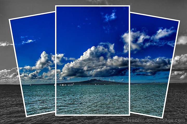
Rangitoto Island off shore from Auckland, New Zealand.
I shot this for the Symmetry challenge but didn't feel the island was prominent enough for that challenge.
Editing Steps: Convert from RAW
* Shadow contrast +25
* Hilight contrast +45
* Saturation +57
Shadow/Hilights
Tone Map
Neat Image
On the island and water
* Hue -14
* Brightness +15
* Contrast +25
On the sky
* Brightness -10
* Contrast +18
Took 3 copies to make the "snapshots"
* rotated -10, 0, +10 degrees
* cropped to 1166x1750 pixels
* added 0.4cm white border
* rotated back to 0 degrees
* masked off new background caused by rotation
* dragged resulting images on top of base image
With the 3 "snapshots" masked out
* Levels: 19, 0.84, 255
* Slight curves adjustment
* Brightness +6
* Contrast +17
* Saturation -100
Flatten
Resize
USM
Save for web
Statistics
Place: 25 out of 244 Avg (all users): 6.4643 Avg (commenters): 7.5769 Avg (participants): 6.2970 Avg (non-participants): 6.6016 Views since voting: 2089 Views during voting: 483 Votes: 224 Comments: 30 Favorites: 11 (view)
Strong points: The 3 overlapping windows combined with colour on B/W give this scene a lot more interest than it might have had all on its own. The sky is beautiful. The little sailboats draw you in.
Possible weak points: Very strict interpreters of "triptych" had a problem with this. The image looks a bit overprocessed. It is a rather centred composition, even though the horizon line is not at centre.
Technicals: The exposure/shutter speed combo you used looks to be right on. Your presentation is excellent. The processing looks (to my eyes) just a bit too strong (oversaturation in the coloured areas, too much contrast at the expense of detail).
Overall: A beautiful entry for Triptych, and you got an excellent score to go with it. Congratulations!
I am not usually a fan of the fake divisions but this works very well. OK, I am assuming one picture with drawn borders and selected desat and maybe you actually put together several photos, which would be even more impressive. Regardless, I like the effect very much.
I really like this one. The different placement of the three photos/sections is great, and the black and white background forces me to look at the coloured sections. I think that the colours could have been slightly lighter/brighter. However this is one of my favourites.
I like the color portion and i like the unique take you have on the theme.
but i do think the black and white portion is lacking a little punch.
i know it's not the major part of the image, but it sticks out to me.
Technically, this is 4 panels and the rules call for 3.. The background that's in b & w is the image too, plus the 3 panels you've left in color. The picture is divided into 4 images.. That being said, it's very beautiful. It's a 10 for me and I hope it doesn't get dq'd becuase of that.. I love the way you separated the images in the middle..





 Add photograph to your favorites
 Add photographer to your favorites

 Photographer found comment helpful.


