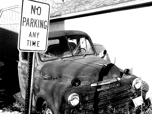
what bothers me most about this picture is that its my second highest rated... i don't really care for it as much as all that.. i thought it was humorous and all, but now i have to take 3 pictures with a higher rating to get the thumbnail out of my profile.. i goofed on the spelling in the title.. its all very embarrassing for me.
looks a bit blown out to me...a better exposure, color, not BW or if monotone sepia, antiquity looks better in sepia for my tastes, and keep the sign but chose a better angle and make it less prominent.
The lighting here is a bit harsh to fully realize (what I believe) you were trying to achieve here. Earlier or later in day the light would be more cooperative giving you more control. I like the compositoin, but the light is just too harsh for GOOD b/w contrasts.
TC




 Add photograph to your favorites
 Add photographer to your favorites


 Photographer found comment helpful.


