Greetings from the Critique Club! ...and congratulations on a high-placed image!
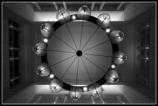
The first thing that strikes me about this image is the abstraction and clarity of line. The gradation of tones is rich and satisfying and pulls me in to discover the subject. I like that the architecture slowly reveals itself...that the eye is led to the ceiling and out to the walls then back to the chandelier.
After looking for awhile, however, I had a sense of something being askew. It appears that the lens distortion causes the lines of the windows left and right to slant inward...thus breaking the perfect nature of the symmetry. I don't think cropping more would help. Though a square crop would eliminate this minor distraction the architecture would be lost. One thing that is asymmetrical which does not, for me, hurt the image is the slight rotation on the lines of the light fixture...in this case the slight break in symmetry helps add to my experience of the subject.
Overall, a technically well done image that makes me pause to discover its true nature.
Beautiful shot, great symmetry and another one where B&W do justice. Because it's a nice shot, it's hard to give any useful comments. I will be picky and say that some of the lights look a bit blown, but I don't know that you could control that. Also, the windown on the left side seems to be darker near the bottom and throughout really. 9 from me.
nicely done and impressive in B&W, but i wonder why the light fixture(?) doesn't align parallel/perpendicular with it's interior to make this image 100% symmetrical in both horizontal and vertical views--just an observation. i like the tones.
Intersting subject matter. It always amazes me how ordinary, everyday things, given the right perpesctive - can be captured as works of art. You have an eye for it. Nice job





 Add photograph to your favorites
 Add photographer to your favorites

 Photographer found comment helpful.


