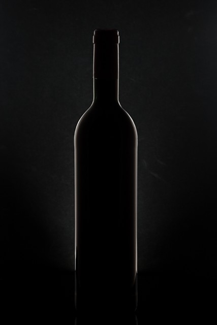
Admittedly, I love minimalistic photography, but this shot absolutely rocks. It's simplicity speaks volumes, I believe. It meets the challenge well, as it is symmetrical, and it balances space and 'occupied space' well too.
I honestly cannot come up with anything to make this a better shot, unless it would be to use another color for the light, just to grab the viewer's attention. Obviously, most of the commenters liked it as well, pulling from five years of dpc experience, I suspect most of the low voters are people who do not like minimalistic shots, people who like for the story to be told within the photograph (whereas your shot tells the story by what is NOT in the photograph), or think that shots like this are simple to achieve. It's not that they are wrong or bad or shouldn't be voting, that is just some of the voter mentality that is out there.
6.2 for your first challenge is not bad AT ALL, and you have a shot you can definitely be proud of. I look forward to seeing your future entries, and will be looking for one of your shots on the front page, soon.
So very elegant. Really like the lighting. As a study I like it as is. As for the simplicity it works.
If I was to wonder how to spruce things up, not that it's needed. If two small glasses layed to rest and create a v shape with stems, or something similar, would've added just a bit more to the composition.
I had expected this to do better in the ranking - it was in my top 10, but I suspect that you are right in your supposition that it is too 'simple' for a challenge entry. I guess also that the marks on the background may have damaged the score, although once they are ther there isn't a lot you can do in basic editing. Good work, and I may take this idea and see if I can recreate it as I desperately need to learn lighting techniques.
You have made an excellent start to life on DPC - looking forward to more of your entries in due course.
Great idea. Simple too (Although I think it might have taken time to actually setup the shot). I like the idea and there's not much I can say that would help. If I were to be super picky I would say that on the left of the bottle there seems to be a smudge of some kind on the background. Not sure what that is. 9 from me.
There are some lessons to be learned in this challenge. Your image is one of the instructors' tools. Wonderful use of light and form to create this simple pleasure of symmetry! Well done. Bump to 10!





 Add photograph to your favorites
 Add photographer to your favorites

 Photographer found comment helpful.


