Framing and cropping seem less than wonderful (note: the bottom and left sides are the hardest to look at, but the other two sides aren't great either) And your contribution to this person's art is???? Photo is nicely focused. 6 Swash
terrible. its just a straight on image that isnt even yours. Im all for sampling in an artistic way, but you havent done anything with it to make it more interesting
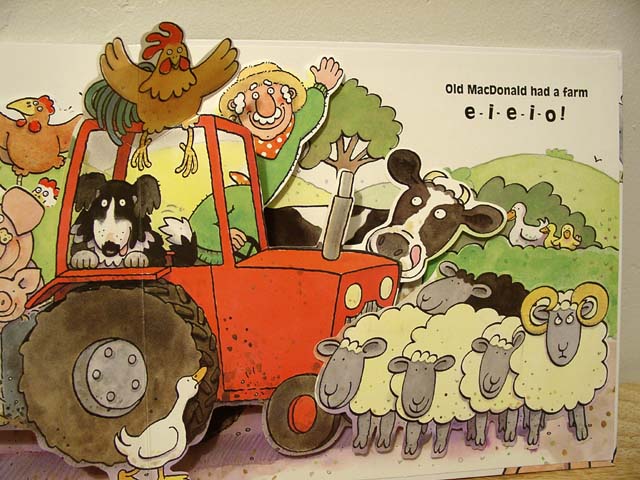
This looks like a photo of a page in a book. I realize that it is childhood related, but I don't think it took much effort. For being such a simple photo (in my mind) there should be no technical flaws, yet the angle and frame are off. The lighting is great, you did a wonderful job keeping annoying glare and reflection off the page, and there are no distracting shadows. Old McDonald definately reminds me of childhood. Good luck in the challenge.
Don't take this personally, but i believe that photographing a page from a book like this is a little less creative that I like. Granted, this is a childhood book, but showing just this page in a full frame is 'borrowing' from someone else's creativity rather than creating your own... - jmsetzler
I think this loses something because the 3D nature of the book doens't show up well. Although I like the colours etc, I think that's really down to the book's illustrator. Kavey






 Add photograph to your favorites
 Add photographer to your favorites


