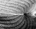
Used tungsten white balance setting for image. Set up was using two lights, one glancing across the back and the other to the left and slightly above. The light in the center is one of those round battery ones that you put in closets. I carefully folded each page, trying to maintain the symmetry of form as well as the balancing act of not having them pop out to flatten again.
PP included exposure adjustment, brightness and contrast, and resize and resharpen. The color was adjusted to add more blue to the image, and I also did a saturation adjustment to give it more vivid color.
As a note: I hated this image and was not going to submit it, but decided I would do a test to see if images I really don't like would do well. Apparently they do. My favorite images are actually my lowest scoring images. Strange.
Statistics
Place: 12 out of 249 Avg (all users): 6.6879 Avg (commenters): 7.5455 Avg (participants): 6.3051 Avg (non-participants): 6.9184 Views since voting: 2517 Views during voting: 266 Votes: 157 Comments: 17 Favorites: 0
I really love this as the colors as just so beautiful and almost look like a feather pattern. Adding it to my favorites right now and you as a favorite photographer as well..... Thank you so much for you comments to some of my images as I really do appriciate ir very much.....
Good imagination. It's shots like these that always get me to thinking 'Why didn't I think of that.' I don't know where you layed your book down but I might have chosen some place else. The blue on the left is quite dark and moves into a lighter blue on the right. The center light is also not so centered. Just minor details that keep it from a better score. 7 from me. Good job.
pretty, though i kinda wish that the words were more clear in the pages so that we could read them, and allso i think it would give it more depth.... nice picture though...







 Add photograph to your favorites
 Add photographer to your favorites


 Photographer found comment helpful.


