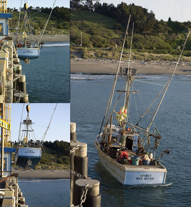
Back to comment. Interesting subject for a triptych. I like the layout. I feel that having the smaller panels on the left, really helps the flow of the story. Just seems to be lacking something. Maybe more vibrant blues or greens? Something to make it jump out, know what I mean? Technically, all three images have great exposure and are perfectly in focus. It just needs more... pizzazz...
The panels are busy and there is only a partial border between the top left panel and the right panel. Consistency is also an issue with white balance amongst the panels. Consistent color adjustment and clear, distinct borders would make it easier to appreciate each image and the whole.






 Add photograph to your favorites
 Add photographer to your favorites


 Photographer found comment helpful.


