Tough score here man. I don't normally read the other comments before eposting mine but I noticed you had 11 and I was curious as to the response. You got some really excellent critiques in challenge and I will echo most of them here.
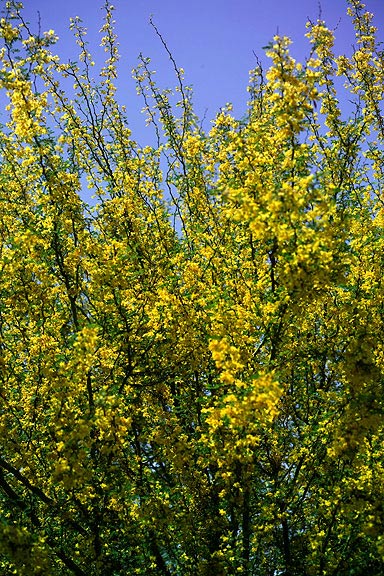
This doesn't really fit the challenge. At least not in the way DPC voters were looking for. The focus is wierd with some branches kind of in the middle being out of focus. And ultimately you have no real center of focus, no main point of interest which will not keep people at your image for longer than it takes to hit a score.
You have some really nice plant and flower images in your portfolio. This unfortunately just isnt one of them. Keep shooting and entering, the scores are bound to go up. Goo dluck!
Even though the colours of blue and yellow are a nice contrast there is nothing in this picture that draws my eye which is frustrating. If the larger yellow flowers almost central to the picture were in focus with everything else in a blur this would have drawn the eye. I also dont understand is application to the theme Symmetry.
I find this image quite boring. There are only two main colors, there's no place where the eyes are drawn to and the subject at hand (small leaves and flowers) just don't do well when compressed as jpeg. Next time, add an object to focus on. -2-





 Add photograph to your favorites
 Add photographer to your favorites

 Photographer found comment helpful.


