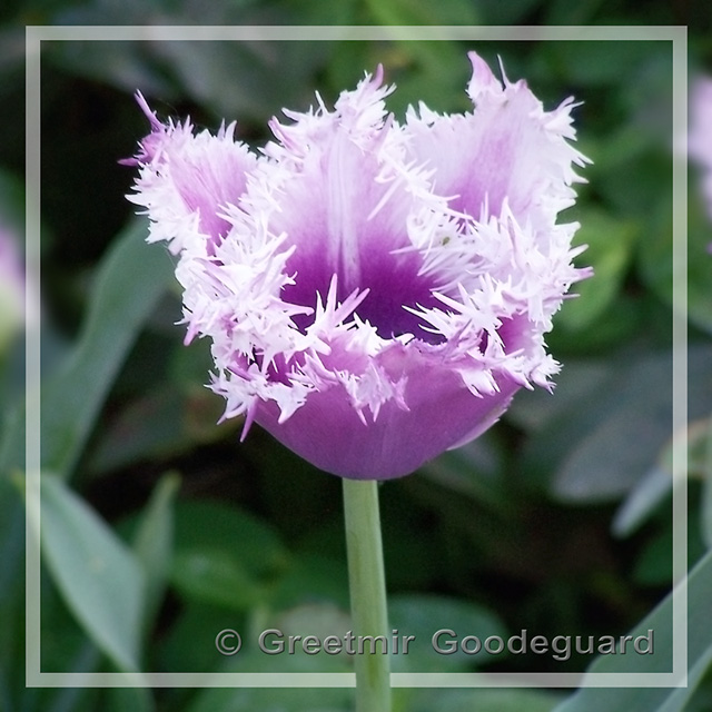
The tips of the flowers WERE glaringly white IRL and to my eyes ... I did not think to grey them down with levels to stop "BLOWN" comments because there was SOME white there ...
Minor edge noise and blur has been added (in a vignette fashion) on purpose because I thought it made the image esthetically better.
Fond of flower shots so the tulip grabs me. The bg is complimentary w the tulip it's the tips which as u said glaring but does have a nice fringy effect..
I like the subject -- I'm a sucker for flower shots myself, and this tulip is strange looking in a neat way. The lighting seems good and the small depth of field (blurring the background) is appropriate for the type of image. The semi-transparent border (with the stem going across it) is very appropriate -- I was actually thinking of doing a similar border on one of my own images lately.
Compositionally, a centered flower makes sense, although the petals are symmetric but not quite symmetric -- that bothers me a little bit. Nothing major though.
Saturation seems good, although I'd like to see a little more and compare -- it might help a bit.
Three major complaints though:
1. Focus. The front of the flower is in focus, the back isn't. It detracts a lot from the quality of the image since there is a lot of detail in the back of the flower. Actually, looking at it, the flower looks almost superimposed on the background -- did you use a soft focus filter or is it just my eyes playing tricks on me?
2. Blown highlights. The tips of the petals are blown to full white, as far as I can tell. This is one of those cases where shooting raw might help and decreasing your exposure slightly to avoid blowing the highlights.
3. Noise. The image has a decent amount of noise to it, especially in the background. Noise in the flower doesn't show too much but the background noise hurts the image. The good news is that neatimage is free to download, and there are a host of other programs that would clear that up yet leave the detail in the flower.
Obviously, 1 and 2 need to be addressed when the image is taken, and 3 could be fixed now. The good news is it really isn't the subject and composition, all of that is good. Just a little more aperture and a little less exposure and you'd have a great file to process. Overall, a good image and good presentation, just a few minor things to fix to make it a great image.
This is just Awesome, Greetmir, actually a very pleasing image in everyway, and just so good, I must add it to my favorites.....
This should be a DPC print, IMO.....
Thought I would add a comment for you. Love the shot. I feel that the flower is too high up in the photo, needs to be a bit more central. Some of the white ends of the flower is glaringly white. Other than that it's a great photo and subject. I like the border and the way that the stem sits in front of it.




 Add photograph to your favorites
 Add photographer to your favorites


 Photographer found comment helpful.


