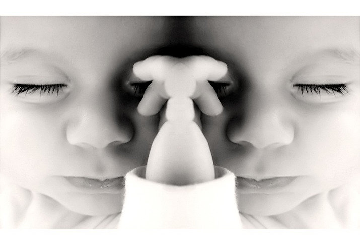
Baby Joaquin again...isn't he cute? Lol, I'm turning into such a goober! Merged a single photo that I vertically flipped. It was actually an accident, but I thought it looked really interesting/disturbing, so I'd thought I'd enter it since it is expert editing month :D
For those who don't know: Rorschach was the psychologist who came up with the inkblot test. It took me days to come up with a title for this, but I think it suits the image well; not only is the entire image like an inkblot, but the center form surrounded by black especially looks like one (more apparent as a thumbnail).
The original image was actually very shakey, but after a lot of smart sharpening and meticulous dodging, burning, and healing, it came out looking suprisingly focused. Although, I could be wrong about that...but I'm sure I'll get yelled at a lot if it is indeed blurry.
Had some trouble with neatimage on this...there were already strange lines from basic editing, but neatimaging and sharpening made it 10x worse. You can see some on the nose, they look like lines or breaks inbetween where the tones should fade smoothly. I've seen this before on other entries, but I always assume it was the editors fault by doing sloppy dodging or burning. I fixed most of the lines with the healing tool (I LOVE that thing!). However, I found it strange that even though it is the same image on both sides, the lines mostly showed up on the left face...weird. Can anyone tell me what causes those lines?
Anyway, I really hope this does well, I love it.
:::After Challenge:::
I am REALLY dissapointed in how this ended up. It really i one of my favorites and I honestly think it deserves more than a 5.5
Oh well, I guess it could be because it was expert editing month, but still :(
Statistics
Place: 344 out of 573 Avg (all users): 5.5205 Avg (commenters): 6.2857 Avg (participants): 5.4132 Avg (non-participants): 5.7800 Views since voting: 987 Views during voting: 254 Votes: 171 Comments: 17 Favorites: 1 (view)
I'm quite surprised by your score as well - the photograph deserved better. I suspect it may be because some viewers were taken aback by it. Upon initial viewing, it's kind of disturbing, but when you look at it and realize what it is, it's not only harmless, it's incredibly sweet. Sadly, it's that first impression that most people use when voting, particularly in large challenges. It really is a very fascinating and well done photograph.
This does pull you in, but then horrifies you for a minute and makes you look away, then sucks you back in. The child is beautiful. The fingers over the eyes is quite disturbing. It reminds me of looking at the Siamese babies and how they were viewed as freaks before surgery was possible to separate them. To be sure, this is art that can stand on it's own. Great job!
I think this would have worked extremely well in symmetry. Seems .llike we always miss the "right" challenge in just a few days. I think this is a very nice capture. Good detail and a ton of interest. A little abstract, but that is what really makes this photo stand out.
Yeah, but unfortunately symmetry wasn't expert editing, so I couldn't have put 2 images together anyway :(
I think this would have worked extremely well in symmetry. Seems .llike we always miss the "right" challenge in just a few days. I think this is a very nice capture. Good detail and a ton of interest. A little abstract, but that is what really makes this photo stand out.
A creative idea, executed quite well. The composition is ambiguous. The melange of hands in the center wants to be the focal point since it's lighter and framed by shadow, but it's out of focus and dead center, so the noses compete with it (and each other) for being the focal point. This leaves the viewer somewhat confused, which would be very bad for most photos but works very well here. The ambiguity gives it the "interesting/disturbing" feeling that caught your attention and makes the photo work.
The very subtle tint and the nice gradations are not what one would expect in an inkblot, which is strictly black and white. But this isn't an inkblot; it's just a photo suggestive of one, and these elements bring it to life. Well done.
I don't think the white top and bottom only frame works very well. At least make it go all the way around, but I'd rather not see a frame at all here. And the sleeve is so bright it's distracting; a light gray would be better, and something with a subtle texture would be a plus.
There is a fuzziness around the eyelashes that looks like jpeg artifacts, although it could be a side effect of one of the other filters you used. It isn't really noticable, and I only bring it up because of your question about what caused the lines on the nose; it may have been the same thing. Ideally, jpeg should only be used by the camera (be sure to use the highest quality) and for the final product; always use a non-lossy format for all intermediate steps, such as transferring to/from neatimage. (And if you're using the free demo version of neatimage, that's probably the problem; it only supports low quality jpeg output.)
But intriguing as this photo is when first exploring it, it doesn't have the appeal to attract viewers again and again (although I can really only speak for myself here). But it was fun to critique it, and I'm glad I had that opportunity.
Cool image! I saw a cartoon today where the pscyhiatrist holds up an inkblot and says "There are no wrong answers other than for purposes of national security." :)
I like the closeup of the sleeping baby's face and the use of B/W. I am just not keen on the mirrored affect. The hands just seem to take away from the cute sleeping child. Nice focus and tones.





 Add photograph to your favorites
 Add photographer to your favorites

 Photographer found comment helpful.


