This is a whiterook tribute.
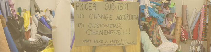
Took three photos at a fabric store here in Venice California - put em together and put a white paint across the whole thing at about 35 percent opacity.
I sure hope to take the brown ribbon it will be my first!!
Statistics
Place: 240 out of 244 Avg (all users): 3.8311 Avg (commenters): 3.4375 Avg (participants): 3.6907 Avg (non-participants): 3.9426 Views since voting: 1163 Views during voting: 346 Votes: 219 Comments: 21 Favorites: 0
OK - I have been very busy so it took me a while to check the results.
First - I need to apologize to all those who took time to give me feedback even though many didn't get that I was trying for this look for the photo. I think its great that people offered constructive crit and didn't just slam me. I had a ton of fun with this photo and couldn't be happier with the results.
I would like to thank the people like larryslights who got my reference.
Whooohooo! my first brown! hehe
Just so ya'll know I didn't put framing around each section on purpose. but there are three separate photos if you can stand it long enough to look at it.
Sorry, but this is just a jumble. Try to think of something specific you want to show the viewer in each shot.
Also, play around with editing software to learn how to enhance contrast. Curves, levels, and other adjustments are available. Each of these shots is very washed out.
Back to comment. At first, I couldn't initially see that this was a triptych as opposed to one long scene. However, now that I've had a better look I can see it. The reason I missed it the first time I think, is the fact that the colour seems dull and flat. Problem with contrast perhaps? It's a creative piece and I love that sign, but if you're scoring low, I'd say it's because of the contrast.





 Add photograph to your favorites
 Add photographer to your favorites


 Photographer found comment helpful.


