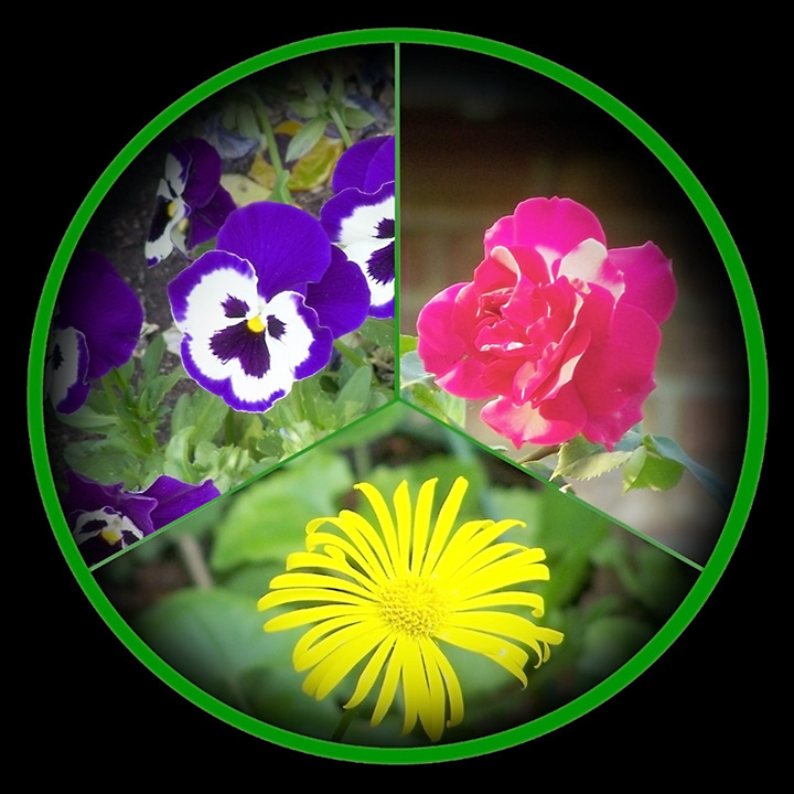
Three separate images rotated 120 degrees at a time and cropped to fit into 1/3 of a circle and dropped on a large white background (leaving tiny spaces between segments ... then vignetted to fade to black ... Circular select and copy and dropped on black background just slightly larger. Process repeated dropping in onto a white background just slightly larger then again and onto a black square background. Some spot healing in blue flowers ... yellow dead leaves with blue flowers darkened and shifted to green and blue flowers pushed in the blue department ... red rose pushed in the red department and yellow flower pushed in the yellow department. White spaces between segments and resulting white circular frame shifted to green. Colour noise reduction, Neat Image, USM ... resize to 720 X
Statistics
Place: 196 out of 244 Avg (all users): 5.3271 Avg (commenters): 6.1667 Avg (participants): 5.1386 Avg (non-participants): 5.4956 Views since voting: 995 Views during voting: 341 Votes: 214 Comments: 20 Favorites: 0
great idea for using a circle to present a triptych. love the flowers, I think the purple one turned out the best. and i love the use of vignette, but I think I would like to have seen it more evenly distributed through the circle. very pretty!
Thank you for sharing your processing steps. I think the circular format is very interesting and will come in handy for me someday. I particularly like the vignetting that gives the triptych a slightly rounded look. Oh, and the flowers are pretty too.
A unique approach to a triptych! I like the idea alot, though the green of the circle to me was a bit strong. For DPC with such limited space, it seems some was wasted by the circular design, but I do think you pulled it off well and did some good photoshopping to get there.
I agree with some of the comments below. I think that the three images taken individually are pretty nice. Together, however, there is not a visual impact that causes the viewer to be impressed.
I don't prefer the "peace sign" presentation - it causes me to focus more on your processing when I look at it than on your images - but I do like what you did with it in terms of having a darker area where the images are on the edge of the circle.
I also think the image is a little unbalanced as far as having two of the images have green backgrounds and one without. Perhaps choosing different pictures or a different layout would have suited this challenge better. Overall not a terrible entry, and one I am happy to have seen.
I like the inclusion of the CND/peace sign, but ultimately this image does nothing to excite me. The base images are clear and well processed though. 6







 Add photograph to your favorites
 Add photographer to your favorites

 Photographer found comment helpful.


