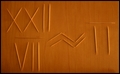
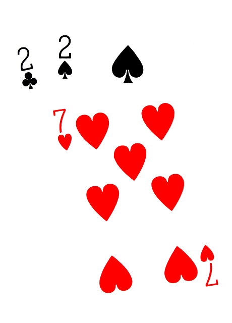
I didn't give much credit to any of the attempts which were based on 22/7 (fractional form). This is NOT equivalent to pi. Also the division symbol is not represented.
I really don't like this. It just isn't photographic in appearance and even ignoring that it doesn't appeal to me aesthetically. The concept is fine and honestly I've seen worse expressions of the 22/7 idea but my first reaction was that you've completely constructed this on your computer. I'm pressuming that this is actually based on a photo and that the adjustments are done by heavy use of levels in Photoshop, to be honest I think you would have had something if you went for a more natural appearance.
Clever. I don't really have a lot to say about it. It is technically very good, but I don't find it very inspiring. Bonus points for thinking outside of the box, though.





 Add photograph to your favorites
 Add photographer to your favorites


 Photographer found comment helpful.


