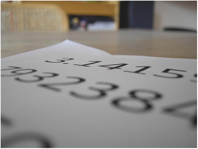
I took a quick peek down at your comments recieved for this image. I was curoius as to what was left and I am pleased to see that you recieved some really good and well thought out comments in challenge. You actually got some amazingly detailed comments that I wholeheartedly agree with. Without going into too much detail the background issues, th epaper layout and use of DOF and the in general flat feel of light and colors are all reasons this scored low. And overall it just doesnt hold alot of interest.
Play around more with your editing, look over high scoring images and study what they have and do that grabs the interest of the viewer. Keep working at it and playing and your scores will go up.
Hang in there Michael. You are young and will learn fast. I expect that I will be commenting on your 6+ scoring images soon enough.
The idea could have make it but... There's some disturbing points: the background isn't simple enought to keep the eye on the subject, and in my opinion the fonts of the number are too big or you are too close, and the lighting could have been used, too.
The DOF and the low angle make it hard to see what this actually is. Be careful of your backgrouns - this background is not relevant to the shot, and is distracting. Experiment more with different lighting. Lamps are great because you can move them around and easily experiment with different lighting for a small scene.
This looks like an experiment in shallow depth of field, but the composition doesn't work well for it. It seems like the goal was to have the begining of the number in sharp focus and then have it fade off out of focus as it continues, thus demonstrating the infinity of pi. However, the table top, chair and the rest of the background distract from this. It would be a stronger message if the all we saw was the white paper and numbers on it instead.
Too much in background that is irrelevant to your message. If you need something in background, use something a little more uniform than black / dark grey, tan (chair) brown (wood) and white (case in upper right and item on right side of left bookcase shelf).
I think it's a little under exposed, the dof is a little shallow and the focus is on the wrong part of the image. Compositionally the out of focus 8 is dominating the 3.14. For me the image just doens't work. If it were a little brighter and you managed to compose the image with the 3.14 as the focal point, it would have been quite successful.






 Add photograph to your favorites
 Add photographer to your favorites

 Photographer found comment helpful.


