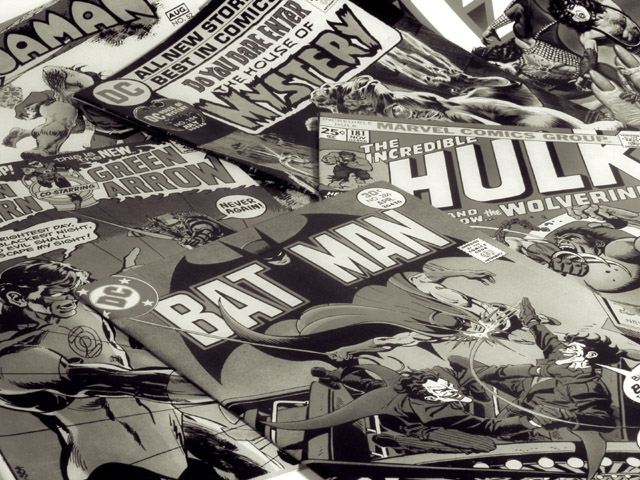
In my opinion this photo did not work in color. My intention from the begining was to submit it as a b&w. There was just too much color. Your eyes went everywhere. It was hard to focus and really see the comics. I guess I could have submitted a color photo and got a better score but my intent is not to please the voters but to please myself. -Charles
excelent photo. I love the black and white here, but I'd like to see the color version as well for comparrison. I love how they fill the frame and how you have curved them toward the back to add dimention, rather than just a flat photo. great job and good luck in the challenge.
This is an excellent photo but one thing I've always loved about comic books is their bright, vivid color. The use of b/w in this photo takes away from that, at least for me.
Nice arrangement and good choice of subject. The B&W is fine but I comics are so colourful I'm kinda surprised you didn't leave it in colour. 8 - floyd
Take the My out of the title so the viewer can make their own connection to their childhood. Childhood Literature I think is more compelling for your audience.
I was wondering when comic books would come into play. I think good colorful subjects would display nicely in color. Were you trying to "age" them? The price does that, for anyone knowing comic books. (Unless they suddenly got cheap again!) 8 Swash
I'm shocked that this is not in color. Why? I can visualize the strong comic book colors and they add so much. why? why? why? okay, so it's up to you. I'll lay off. LOL. nicely composed shot. Good choice for this challenge. 6, just-married
Nice way to remember people to the old days. Very smart to make it BW picture (although these mags used to use screaming colors like green and signal red. Nice sharp picture also!
Kabooom!!! Zhoooooosh! Whhhhhoooooosh!! This comics lingo translates into this is a great image. Excellent composition and the toning is superb. It probably would have been mighty garish if this had been done in color. The image is well, well controlled and balanced and I have been studying it on what makes it work (i.e. it ought to be very busy and yet it is relatively quiet to the eye!). First round of voting:8; definitely will revisit this lateron this week. Journey. ~~~~~~~~~ZZZZZZAAAAAAAPPPFH~~~~~~~~~~~~~~~~~~ Update: Another reason I like the B&W is that it gives a nostalgic flair to the image; it harks back to the past, to perhaps a more simpler life with B&W tvs and such. This is one of two 10s I am giving out this week. Of all the pictures I consider this one the most sophisticated and the strongest in design. I have one little nitpick: would have liked to see the little triangle in the top left corner black. It being white (and more white surrounding it) makes it somewhat tempting for the eye to wander out of the image. Unless you are a purist, you can see this for yourself in Photoshop by filling that triangle with black. Congrats 10 Journey






 Add photograph to your favorites
 Add photographer to your favorites


