Author Thread Comments Made During the Challenge
Post actions
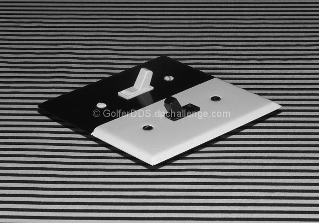
Nicely composed, if a bit static. If it were mine, I'd have gotten in a little closer and lower down. The lighting falls apart a bit, too. The white side of the switch plate is distinctly gray.
Post actions
The image is very interesting - complex and simple at the same time. The clarity, focus, textures are all good - this is a complicated simplicity but it works for me
Post actions
excellent....like the lines against the switch plate and the perfect patternization of the BW. great comp and the centering works for me on this because of the super angle. Well done! Bravo....(or Brava just in case)
Post actions
I really love the strong graphic-design element to this photo. Black and White / Off and On. A great submission to the challenge!
Post actions
Nice black and white/pos/neg composition. With this picture a simple light switch becomes quite interesting. 7
Post actions
I personally like this, the symmetry and the lines. For the challenge though, the linear background may not help the photo get high marks. Cool idea.
Post actions
Great setup, clever use of solids & stripes at an angle, lighting is just right.
Post actions
Very unique B&W. It only needs to be rotated about .5 degrees or so counter clockwise to be perfect.
Post actions
I like the object but the BG is a bit dizzy
Post actions
COOL SHOT! It kind of hurts my eyes....lol
Post actions
I love the contrast in this. I do think it would work better if more brightly lit though. Good shot. Good idea.
Post actions
Nice black and white geometry ! Could have been shot from the top.
Post actions
Good idea, but I dislike the background as I find it to overpowering. I think it would have been stronger with a plain black or white bacground.
Post actions
Very strange bout it should have been straightened up slightly.
Post actions
Post actions
Great contrast. Neat shot.
Post actions
Wow. great idea and execution. love the contrast in lines. great in B&W ;-)
Post actions
Great lines and contrast. Very nice - simple yet there are things in there that are interesting. The lines don't match up from the left to right though. Is this barrel distortion?
Post actions
Delightful symmetry, clean and simple; well done.
Post actions
Very clever and perfect for the challenge. Love the stark contrast between the pure black/white.







 Add photograph to your favorites
 Add photographer to your favorites


 Photographer found comment helpful.


