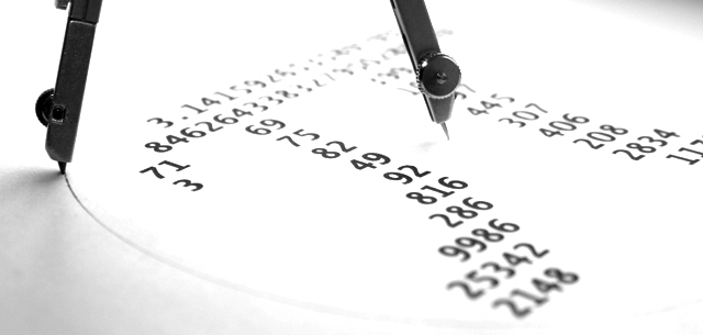
I've seen something like the with Pi written Pi at school and thought of that when I saw this challenge, "Pi 2". (Of course) there had to be a circle (as a circle is something infinite, like the number Pi) and I chose to add a pair of compasses just to make the picture (I hope) a little more interesting. When I shot the picture, I wanted the result to be wide-stretched and horizontal, so after taking it I cropped it a bit in Photoshop. I converted the picture to duotone, but when I wanted to upload it I remembered duotone is not allowed. After that I made it high-key by adjusting the levels. Here is the result.
Statistics
Place: 21 out of 92 Avg (all users): 5.9723 Avg (commenters): 6.8333 Avg (participants): 5.7273 Avg (non-participants): 6.0239 Views since voting: 950 Views during voting: 382 Votes: 253 Comments: 8 Favorites: 0
Compositionally, this is a balanced photograph, I think. There is a good "interaction" between the numbers and the compass. I also think that the long, narrow crop works well as well.
I like the high key effect you have gotten here. It adds interest to the shot, and it is also appealing that the numbers are readable, even as they go "out of focus" in the difference.
You had a commendable score and placement, but I suspect some viewers were turned off by the high key effect -- it does look blown out, and some of the detail is gone in the compass.
Good work, and if I need to further clarify or explain myself, please let me know.
Karma





 Add photograph to your favorites
 Add photographer to your favorites

 Photographer found comment helpful.


