Author Thread
Post actions
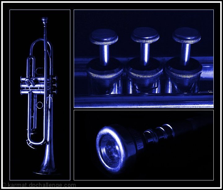
I like the colortones and graphic deel to this one. Well set out and it just please me.....
Comments Made During the Challenge
Post actions
Nice layout and subject but the top panel has a blue tint in the black areas unlike the other two panels. A little distracting. Other than that a good shot.
Post actions
Great set - love the light and blue tones. Very nice.
Post actions
Post actions
Class. The black looks murky in the top-right image though. Strong arrangement.
Post actions
nice images and nice details shots. the blue doesnt do it for me, but seems to achieve what it sets out to do. 7
Post actions
Nice composition. Only negative comment would be the background color in the top right section doesn't match the other two which makes it somewhat distracting. Other than that....very nice.
Post actions
Perhaps a little dark, but I like the subject and the blue treatment.
Post actions
I like the blue hues here! Great shots *7*






 Add photograph to your favorites
 Add photographer to your favorites

 Photographer found comment helpful.


