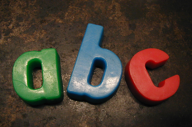
Magnetic letters and a cookie sheet in Isaac's classroom, fluorescent lighting, macro mode, spot metered. I traded the little bit of glare for better color on the letters and the background.
Cropped a little, resized, sharpened, simple.
Statistics
Place: 155 out of 262 Avg (all users): 5.1631 Avg (commenters): 5.4167 Avg (participants): 4.9397 Avg (non-participants): 5.3846 Views since voting: 1370 Votes: 233 Comments: 12 Favorites: 0
The background is ugly.. mayby a white sheet will be better
I think you used flash.. there is lightreflection..
tripod an no flash is a big help if you want get rid of the reflection.
Simple on two planes. A good arrangement too. I think you should have tried to postprocess with neatimage or other two get rid of the "aging" on the surface of the letters. That plus the slight reflections make them look less apealing and detract from the shot.
Excellent concept that I wish was carried out differently, as I do not like this combination of subject and background in regards to color. They seem to clash I do like the way the letters are arranged. Also, it appears the lighjting is uneven and there is too much glare coming off the letters.
Great concept, the primary colors are great, and the positioning of the letters give it a simple childlike quality, the only thing I really see wrong here is a small glare, but sometimes that cannot be helped, this is good I like it
i like the choice of the rusted background, as opposed to the standard white or black - not exactly sure why, because it wouldn't necessarily work with all subjects. maybe it's the contrast of of the bubbly/colorful nature of the letters and the hard/aged look of the background. nice job.






 Add photograph to your favorites
 Add photographer to your favorites


 Photographer found comment helpful.


