desaturate (not completely)
sharpen
re-size
add border
save for web
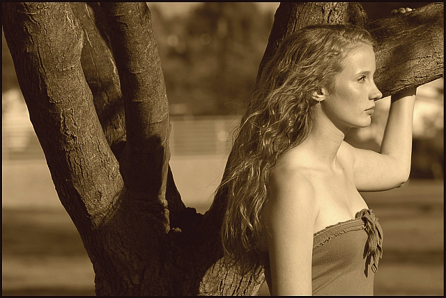
POST: ok, i am updating this in september (about 5 months after this was taken). i now realize all of the things that i could have done to make the picture better, such as a different position for my model, different color for the picture, a tad bit more contrast, and no distractions in the back. still surprised that it got over a 6 though.
Statistics
Place: 70 out of 380 Avg (all users): 6.1488 Avg (commenters): 6.2727 Avg (participants): 6.0000 Avg (non-participants): 6.2907 Views since voting: 1394 Views during voting: 284 Votes: 168 Comments: 18 Favorites: 0
Hello Marco and welcome to DPC. Congratulations on a lovely image. I think your composition, processing, attention to light and contrast are excellent here. The only unfortunate element is the fence in the background which is not only bright, but cuts the image in the middle horizontally. A touch of darkening would help the fence to be less noticable and not distract from your lovely model.
i think this has the potential to be excellent, but i am uncomfortable with the model looking *out* of the frame; it would feel much more balanced if she were at the left-hand third (still looking to the right).....
while I like the image overall...I think the model should have been on the left looking into the right space rather than this way around. like this, the branches are a real focal point that is distracting as is the 'fence' in the background...also, the particular sepia you used is not really flattering. She is quite pretty...I don't want to be negative, but a little more compositional thought would have bought out her beauty more. On the positive, I like her pose and the look of the breeze in her hair...
I like the tones, but it needs a tad more contrast for my tastes...compositionally, she should be facing the other way looking through the frame, not out of it...






 Add photograph to your favorites
 Add photographer to your favorites

 Photographer found comment helpful.


