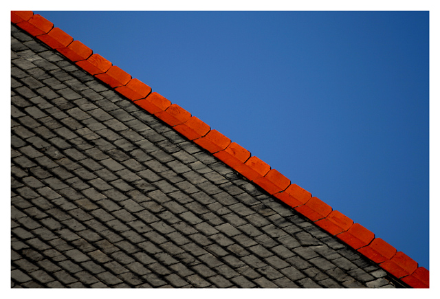
Great colors and texture contrasts, excellent detail, superb composition and you had to go ruin it, at least for me, with a frame and a white one at that. What is it with the frames here, I'll ask again. ALL other sites request that pictures not have frames....why here?????
interesting composition, good textures, nice colors especially the red but it doesn't give me a message of simplicity - I am drawn to the textures and lines in a way that is quite complex
Very good. I like the idea. One thing, because the roof is a much stronger element than the blue sky, I may have had less of it in the shot. I realize that would keep you from having the perfect angle with the red edge. But it might make for a stronger image. 9
I like yours very much: clear structures, clear colour, clear composition but not boring at all. I took a while until I got how to turn the image to understand how the roof is build up. Good luck to you.
Beautiful composition. It's like a photographer's version of Mark Rothko. ...And it reminds me of an idea- you could probably use the same strategy you used creating this photo for representing some world flags! That\'s also what your photo reminds me of.
These colours are simply great together, and I love the red edge of the roof going in the diagonal. Roof pattern gives a very nice element to the photo and I really can\'t deceide whether this is a roof or stones of a road - well, yes, your title helps me. :-) Take 10 from me!
P.S. What about a one-pixel-wide border between the photo and the white border? Just an idea.







 Add photograph to your favorites
 Add photographer to your favorites

 Photographer found comment helpful.


