So my brother never bought me wine.
=(
I did get hollered at for running off with mom's windex.
So I'll probably get a few DNMC comments on this, but I wasn't feeling well and wanted to get it over with.
It took me forever to find a position I liked.
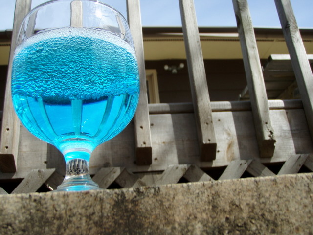
This shot worked out the best for me.
I tried some close-ups on the bubbles and they looked cool, but it was hard to tell what the picture actually was.
This isn't bad considering the circumstances.. But I probably could've done better.
The focus on the background is too clear and too blurry at the same time, it pretty much just looks cruddy and soft, but I hate editing things..
My only goal is to score higher than my first entry, and I think I have a good chance.
We shall see.
=)
----
Hehe. I was a little late filling this in.
I scored much higher than I expected too, and defeated my first entry, so I'm happy with that.
Thanks very much for the comments, guys.
I really appreciate all of your advice and encouragement. One day perhaps I will score a solid five.
=P I'm getting close.
Statistics
Place: 128 out of 172 Avg (all users): 4.8008 Avg (commenters): 6.4000 Avg (participants): 4.3684 Avg (non-participants): 4.9312 Views since voting: 1557 Views during voting: 353 Votes: 246 Comments: 10 Favorites: 0
I think this shot is pretty neat. With your comments above, I would be interested to see what the close up shot of the bubbles looks like. If the challenge is "bubbles" you could have probably gotten away with it & everyone would know what it was. I like how the subject isn't centered in the picture & I love the bright blue color. Maybe a little tighter crop could have worked, but I see you had to leave a lot in so people would know what it was. I am new to editing pictures so that is about all I can offer :) Keep up the good work.
I find it annoying that the surroundings are only just out of focus, instead of either in focus or totally unsharp. However, that IS original :P
That was due to my laziness mostly, so I couldn't blame you for voting me down on that. XD
Originally posted by star155:
I like the concept, it would be better with a background that relates. For example, a bar or high counter top.
I chose this background because as you can see, the distortion of the deck and the lattice show inside the glass. I found them the most interesting pattern, but I understand what you're saying.
Originally posted by Shaman:
I find the background here very distracting. great colour in the liquid, tho. In a dark studio set-up, using the same upwards angle and lighting on the glass, this would have been a 7 or 8. now 5
As I said above, in a different setting the distorted patterns wouldn't be there, and that was what I was mainly focusing on.
I find the background here very distracting. great colour in the liquid, tho. In a dark studio set-up, using the same upwards angle and lighting on the glass, this would have been a 7 or 8. now 5





 Add photograph to your favorites
 Add photographer to your favorites

 Photographer found comment helpful.


