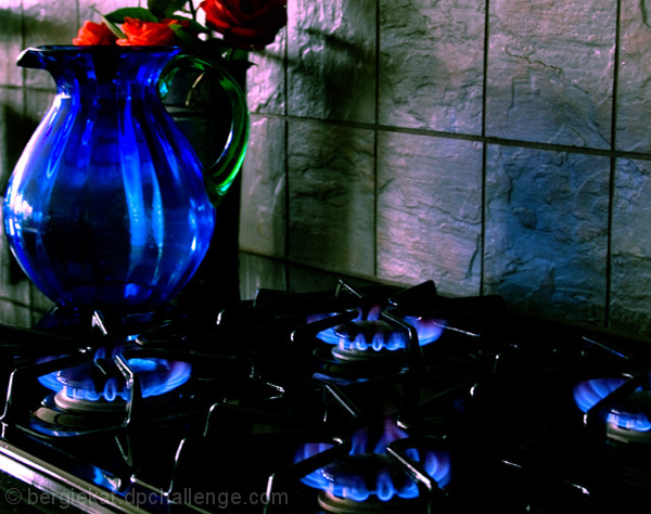
The colors here are great. The dark blue works very well with the overall low key photo. And the complementary color of the tile makes a nice contrast.
The composition is weak. The focal point is the back burner; it's at a rule-of-thirds point, and several lines on the stove and the background tiles point to it. It's shape is echoed by the other burners, which is great. But it seems like the pitcher should be a focal point with it's contrasting texture and shape, and it's position next to the edge of the photo de-emphasizes it. It's enigmatic, and perhaps this was intended (after all, a pitcher isn't typically placed on a live burner). But I'm afraid any meaning escapes me.
The lighting works well; it's subtle enough to make a low key photo and not overwhelm the flames, yet it still casts nice shadows. Too bright on the far left of the pitcher, but it's close enough to the edge that it isn't too distracting.
Love the blues and greens. I also like the way the pitcher seems to mimic the flames. I think the touch of red in the upper left is distracting, and I would score it even higher without the flowers. 8





 Add photograph to your favorites
 Add photographer to your favorites


 Photographer found comment helpful.


