Greetings from the Critique Club.
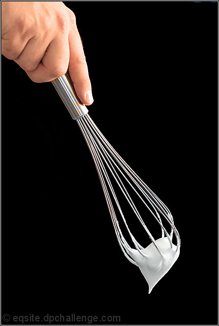
A nice photo. The contrast with the black background really catches the eye. I agree with your assessment, not terribly exciting, but technically well done.
Compositionally, I think it needs more space at the bottom; the negative space would add some drama. And I'd also crop off half of the hand; it doesn't really add anything to the photo. I think the tall, narrow format works very well here, as does the strong diagonal and overall simplicity.
|






 Add photograph to your favorites
 Add photographer to your favorites

 Photographer found comment helpful.


