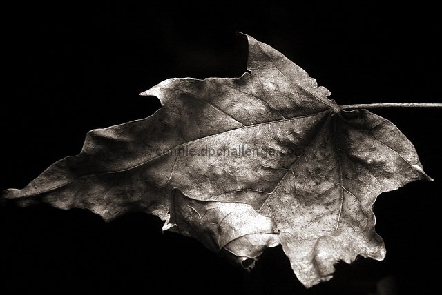
Title should have been... simpler. :) Don't force the theme down the viewer's throught - "Discarded" would have been sufficient and much more effective. The idea of the leaf, the detail of the photo and the lighting (and shadows) are all good. The composition could have been improved by a different placement of the leaf in the frame - closer, farther away, more to the top seems like it might have worked better to me. Overall, I like it.
Beautiful B&W, composition works well, maybe a little bit more space (max. 1 cm) on the left and the bottom would be better for my personal taste, but I like this very much!
Great Pic. Great Contrast. Excellent Choice on the B & W! Simple????? A softer focus would have made it simple.....but w/the sharpness......the veins complicate. 8
Absolutely gorgeous tones, would not chage a thing with exposure, focus, or processing.
I like the comp, but wonder how it would look sith the leaf rotated slightly CCW, and include all of the stem if possible.
This is my favourite shot in the challenge, even over my own :)!
The lighting makes it sooo moody almost really, really old, like something brought to the present from teh distant past. I love it!






 Add photograph to your favorites
 Add photographer to your favorites


 Photographer found comment helpful.


