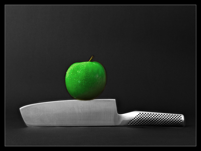
For this setup I used clay to stabilize the knife (hidden behind the knife) and two sticks through the apple, fixed in the clay, the apple balancing on the edge.
Lighting: My 'studiolighting' :-)) consisting of a 500W lamp used for home decorating, bouncing off a white umbrella.
Processing: Convert from raw, 1 layer of selective color, 2 layers of Hue/Saturation to desaturate the knife and saturate the apple, 1 layer of Curves, 2 layers of levels, 1 layer of Brightness/Contrast, 2 steps replace color (I wanted a GREEN apple :-), remove some dust spots on the black background, smart sharpen, crop, border, save for web.
- - - - - - - - - - - - - - - - - - - -
Thanks for all votes and comments and constructive critique, I really appreciate it!! As a newbie I'm here on DPC to learn and all comments are wellcome! :-)
Thanks to Carola for letting me use her knife...
Statistics
Place: 3 out of 149 Avg (all users): 6.6789 Avg (commenters): 7.5789 Avg (participants): 6.3788 Avg (non-participants): 6.8387 Views since voting: 7032 Views during voting: 394 Votes: 190 Comments: 36 Favorites: 8 (view)
It is truly difficult to "critique" a ribbon winner without sounding like I am just searching for things to complain about.
So, I'll tell you what I think works in this shot, and what was appealing, and what I *personally* think could be "improved" upon.
Technically, you have nailed it. The lighting on this is consistent and even. This allows for details to show throughout the shot. It also makes for a very clean, well focused shot. The slight shadowing on the apple also gives just a touch of depth, otherwise the shot might appear to be a bit flat. The focus is good and the water on the apple gives it a nice touch.
Compositionally, to me, it is static. To have the knife straight through the shot, gives it kind of a "ho-hum" feeling. Granted, the knife is in the lower third of the picture, and that gives it a sense of strength, and the apple is just off of center, so that helps to counter the "static" feeling, but it doesn't add any real interest to the shot.
I think technically, you have done a very good job, and the voters rewarded you handsomely for that. Congratulations! This would be an excellent stock type shot as well.
karmat
Thanks karmat for your critique, I really appreciate it! That's why I'm here on DPC; to learn and to improve. I have never ever taken picures like this before (just 'holiday pictures' :) and I'm very much a beginner in Photoshop, so have a lot to learn!!
It is truly difficult to "critique" a ribbon winner without sounding like I am just searching for things to complain about.
So, I'll tell you what I think works in this shot, and what was appealing, and what I *personally* think could be "improved" upon.
Technically, you have nailed it. The lighting on this is consistent and even. This allows for details to show throughout the shot. It also makes for a very clean, well focused shot. The slight shadowing on the apple also gives just a touch of depth, otherwise the shot might appear to be a bit flat. The focus is good and the water on the apple gives it a nice touch.
Compositionally, to me, it is static. To have the knife straight through the shot, gives it kind of a "ho-hum" feeling. Granted, the knife is in the lower third of the picture, and that gives it a sense of strength, and the apple is just off of center, so that helps to counter the "static" feeling, but it doesn't add any real interest to the shot.
I think technically, you have done a very good job, and the voters rewarded you handsomely for that. Congratulations! This would be an excellent stock type shot as well.
Might want to go in at 200 - 300% and clean up your edge editing in the future. (Not that it'd be noticeable on *most* monitors I think, but it's clearly visible on mine.) Some strange effects around the edges of the apple and top of the knife (and some on the handle).
Just for future reference anyway. Just pointing out what I see.
Thanks! I'm really a beginner (and about to discover the techniques with Photoshop...) and appreciate all comments and critiques!
Might want to go in at 200 - 300% and clean up your edge editing in the future. (Not that it'd be noticeable on *most* monitors I think, but it's clearly visible on mine.) Some strange effects around the edges of the apple and top of the knife (and some on the handle).
Just for future reference anyway. Just pointing out what I see.
Nice spare and interesting shot, but - yes how ironic to say this - perhaps a bit oversharpened. :) There seems just too pronounced an edge around the apple for it to be natural. Maybe it's my monitor - one of the better shots though, I gave it an 8.
really nice composition and lighting. the two things that bother me are the black halos around the knife and apple (probably from unsharp mask) and the fact that the apple is the only thing with any color, which makes it look composited or fake somehow to me... i wish the knife had a bit of color in it -- especially a hint of green to show that the apple really is sitting on it.
Excellent clarity and crispness on this image - the lighting is really solid and the composition is very nice - almost wish the apple was a little more to the left





 On The Edge
 Add photograph to your favorites
 Add photographer to your favorites

 Photographer found comment helpful.


