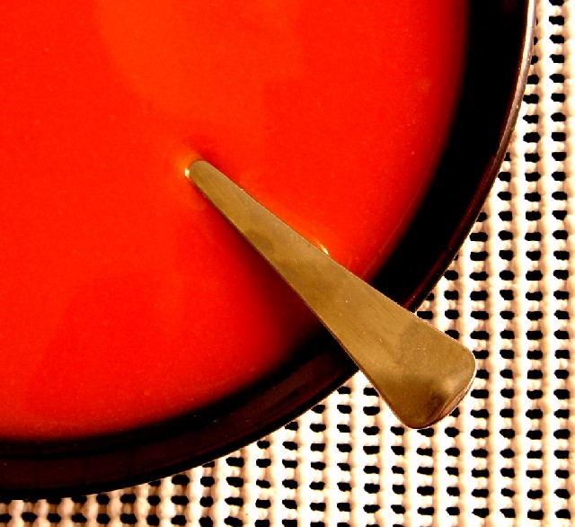
I like the idea you had here, but I do have one suggestion. To me, the photo would fit the "simplicity" theme even better if the background was a solid color with no pattern. The current one seems a tad busy for the theme. Still, this is good work.
A good simple "pop-art" composition, well done overall. I think it might have been better with an evenly exposed white mesh placemat rather than the overexposure there (I presume this is intentional to give the photo some extra dynamics). As I look at it longer, it might have also been good to experiment with different spoons to try to make the spoon more "attractive" (not detailed, but perhaps a little longer out of the soup than it is, or extra wide handle, or some more geometric shape without fancy detail. Our spoons are more shapely ;)
What a RED! Very strong!
I like the color and the composition very much! What I do not like so much is the background: having it structured in a grid is great, but what I do not like is that you used these rubber-coated stuff. It has a sub-structure (the shadows, variing thicknesses) that attract the attention and leads it away from the main subject. Good luck to you.
OK so I know who you are and I will give it to you full throttle! Great! My only nit is the BG under the bowl and spoon lookf a bit blown out.....the rest of the exposure is wonderful and I still like how the background looks like a giant cracker. The composition however is perfect enough for me to give you a 10. Hope you don't get as frustrated here as I have been, but it can be quite interesting at times and you can certainly learn a thing or two. Have fun and don't let the overnighters get you down. RoB
Technical: Most all images submitted fit the challenge. This does well. Exposure composition focus lighting all very good- this feels very Eastern, which in my mind makes it a strong match for the challenge.
Personal: Very stylish looking, but I wish the handle looked more plain, cleaner, smoother.... you know what I mean? It's nitpicky, I know.
This is an excellent shot. Light is very good. The background on the other hand is incredibly busy and really detracts from the simplicity of the mood. 6






 Add photograph to your favorites
 Add photographer to your favorites

 Photographer found comment helpful.


