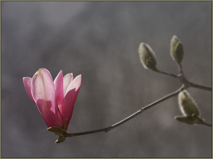
tried to get a hand-colored feel - applied several gradient layers (blue, green, pink) and after coverting to b&w, reapplied parts of the image back onto the shot in color (flower and buds)
Statistics
Place: 361 out of 573 Avg (all users): 5.4576 Avg (commenters): 7.2000 Avg (participants): 5.3968 Avg (non-participants): 5.6078 Views since voting: 803 Views during voting: 228 Votes: 177 Comments: 6 Favorites: 0
I like these minimalistic shots a lot; reminds me of this one which was, to my mind, terribly underated in the Rule of Thirds challenge. And magnolias are such beautiful willing subjects.
That said, this one doesn't work as well for me; here are my guesses as to why:
first, the pink doesn't pop in the same way. It stands out, to be sure, but it somehow doesn't spin my head around. Not sure why. It may be the darker bckground?
second, I think having the branch fade out of focus within the frame is very powerful; I think maybe for me the rest of your branch is a little too much in focus which draws my eye away from the bloom.
A really lovely picure, though, and of a style I wish we saw more of!
very minimalistic!
I like the use of the grey dull background to put all the empthasis on the flower, it really makes it stand out and becomes the main focal point which i'm sure is what you set out to achieve.
If i had to make one criticism it would be the fact that there is too much dead space, although i'm not sure cropping would have helped in this case as I like the fact the buds are in the picture too. Perhaps taking this from a different angle would help to tighten things up a bit? Just my 2 cents. :o)
I love the pink and the focus on the flower, but the rest kind of leaves me "eh." The DOF is good though. What if you did a curves adjustment to really enrich the background, making it much darker, and then the flower would even be more prominent? The gray just isn't working for me. Hmmm thinking out loud.






 Add photograph to your favorites
 Add photographer to your favorites


 Photographer found comment helpful.


