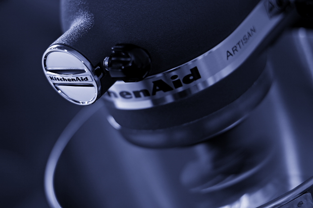
It took some shots to get the logo like I was thinking, spent lot of time adjusting the camera on the tripod to get the angel correct. When that was done I turned on the KitchenAid and took the picture. Reason why I turned it on was because I really want to add some motion to the whipper inside the bowl. Here below you can read how I processed the image.
Converted from RAW to TIF
Changed to b/w
Shadows/Highlights
Used Curves to get this blue color
Litle amount of contrast
Sharpened
Sized and saved
Statistics
Place: 33 out of 149 Avg (all users): 6.0163 Avg (commenters): 6.7500 Avg (participants): 5.7188 Avg (non-participants): 6.1750 Views since voting: 982 Views during voting: 302 Votes: 184 Comments: 13 Favorites: 0
If I were to try to use one word to describe this image, it would be "polished." It is very professionally done -- good focus, details, etc. and would make an excellent advertising image for KitchenAid, I think.
The focus is located on the exact point that the eyes first go to in the image, and though the rest of the image is sufficiently "blurry" it is okay, because the eyes and see (and rest on) what they need to.
The blue hues don't do much for me, in this image, but it is not distracting enough to suggest anything else, either.
i like the focus on the very front bit, and the texture and moody feel. the subject isn't very interesting to me, though. it looks like sort of a variation on a plain-jane product shot, i think. i wonder if there's some way to work in any additional elements?...






 Add photograph to your favorites
 Add photographer to your favorites


 Photographer found comment helpful.


