Thanks alot for all the comments - also nice to have one from the Critique Club! :) I got a tip on how to add text about the picture after the challenge but I still can't seem to figure it out.
What I wanted to say about the picture:
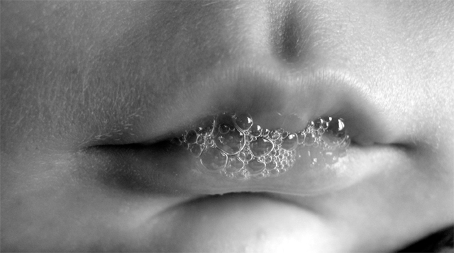
Lighting: daylight from my window.
The model: is my 2 months old firstborn.
The reason I didn't include the rest of the face: for some weird reason I didn't want to post his pretty face on the internet "just like that" (and without his agreement ;)). But this also seemed to be the only way to show the "bubbles" as the main subject.
Photoshop: slightly adjusted the contrast using curves.
My first entry and all that... so I'm just happy that it scored above 4!
First impression - To be honest, it wasn't my idea of an appealing subject on first glance. But I do appreciate that it's an excellent "macro" - very well lit, excellent sharpness and focus, and quite representative of baby bubbles.
Technically, as I mentioned, it's well done. The totally picky would point out the blown spot on the chin, but I had to go looking for something to pick on - it certainly doesn't jump out at you. I think I'd almost like the lips less on the center horizontal - maybe include a bit of the nose.
In the end, after studying it for awhile, it really is a sweet picture. I'd say you definitely won over the parents of young chilren with it!
It takes me a moment to figure out what it is that I am actually seeing. Then, the first thing that my mind figures out is the bubbles (that's good - that's the challenge), then I see the lips. Nice try.
Great detail on the bubbles and lips. It feels weird to just have the mouth though...maybe a crop that included the nose or all of the chin would help.
I have a feeling that this looks much more appealing to parents of babies than it does to other viewers...
Very crisp focus, but on a purely subjective level, I am not keen.






 Add photograph to your favorites
 Add photographer to your favorites


 Photographer found comment helpful.


