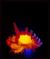
A beautiful architectural abstract, one of my favorite images for this challenge. It could stand just a bit more saturation & contrast; try bringing in the white and black points just a bit in levels, and adjusting midtone pointer to right to increase contrast slightly. The resulting slightly darker, more saturated image seems to my eye a slight improvement on an already exceptional image.
good subject and composition. I think I would have scored this higher as a black and white though (read: the drab ceiling doesn't compliment the colors well - removing the saturation would also put even more emphasis on the shapes) just a thought. 6
Very nice symmetry using existing architecture.
It looks fairly level on the horizon. My eyes may be decieving me, but it may be a hair off. No worries though, score unaffected by it.







 Add photograph to your favorites
 Add photographer to your favorites


 Photographer found comment helpful.


