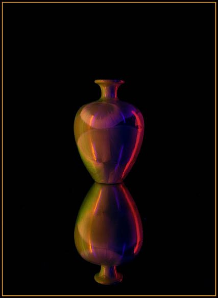
Excellent shot and use of symmetry. I like the dark tones and richness it gives the colors. The centered composition seems ok here, but as long as you have that, you might have just gone for broke and make the vases fill the frame vertically as well, giving complete symmetry of the composition as well.
The kind of thing I was looking for in Simplicity. I'd like seeing this in a larger format. The lighting's just a bit dark for me, but the colors are very rich. Composition's nice and the border is simple and works well.
very nice. the red and blue kickers off to the side really help this image pop. this is another one where i feel the border gives it just that little extra finishing touch. 9
The conflicting white light and neon lights reflecting off the vase are too busy. It looks like it's tilting to the right and makes me fall off my chair (ouch). I like the reflected vase below and the use of negative space above.
I personally think the reflection is TOO clear and bright. I'd like to see the reflection dulled a little, putting more focus on the vase itself. Nice color though







 Add photograph to your favorites
 Add photographer to your favorites


 Photographer found comment helpful.


