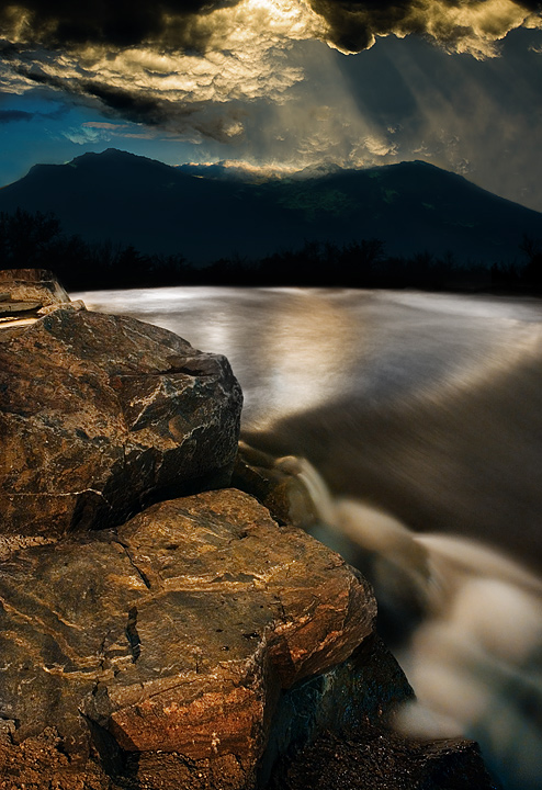
No joke I pieced this together from scenes around downtown Denver. I didn't even leave the city skyscrapers!!! That should deserve a ribbon alone right?
But I took most comments as well said, because I wanted it to look real, maybe hyper-real, but not crazy. Personally I would like to visit this wonderland and this amazingly wide river...that was the only part no one commented on - this river stretches forever, more like a lake. I guess that was the most believable part, even though in truth it was no more than about 20 feet wide. Thanks for the views...
Statistics
Place: 21 out of 308 Avg (all users): 6.7382 Avg (commenters): 7.4194 Avg (participants): 6.5938 Avg (non-participants): 6.8156 Views since voting: 1665 Views during voting: 525 Votes: 275 Comments: 40 Favorites: 4 (view)
Well I like the thought behind this image but I find this frame way too busy for my taste. There is simply too much to look at here and the composition doesn´t do anything to lead my eye around the frame. I feel the rocks are simply in the way of that water and that sky is way over the top for me, it just steals attention. Sounds like I gave this shot a 1, wich I didn´t, it got a 5 from me, I neither like it nor dislike it.
Darker rocks, brighter sky and had you moved slightly to your right you never know what I would have given it :)
Back to comment & bump: I'm not sure if I like the effect the long exposure had on the water but for what you were trying to accomplich, you did an exceptional job. 7
The photo starts amazing, but starts losing it a touch as you go into it. The shutter speed (IMO) should have been a little less so the water still had some water traits left. Looks like it's too smooth & brown in this photo. There is something going on in the upper right sky, too. The blue area is beautiful, but the sunshine rays look odd. All in all, a good effort and still and interesting photo. Take my comments w/a grain of salt as I can't ps for beans!
When you use more than one photo. 3 or 4 in your case, you should understand perspective, relative sizes and masses, lighting ang lighting direction.
This is a bad mix 1
the sky looks like Moses and Mount Sanai...a stunning image with great depth and detail...definitly a contender in my opinion and I have to give this a 12...oh, we only go to 10...
As for most of this competitions shots, I think this is an overkill. The good thing about this one, though, a great shot in the begining. Since expert editing (8).
I like the 3 main elements here-the dramatic sky, silvery water and detailed rocks. Somehow,though the parts don't seem to hang together as a composition.





 Add photograph to your favorites
 Add photographer to your favorites


 Photographer found comment helpful.


