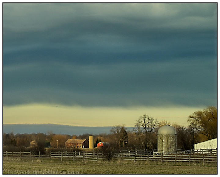
Wow, I like how I learn to see things better just by reading others comments - Melethia is dead on to note how the undulation of the color bands in the sky echoes the undulation of the land. That's very cool!
Positives: Pastoral setting, composition and framing of the farm are its best features. Unusual lighting and color has attractive features.
Technicals: Subdued color works well for this composition. Thought at first the color/contrast was off but checked and it appears right. Dodging the area of the red barn works well to attract attention to it and add interest to the image.
Overall the technicals are weak in several areas. As mentioned in comments it appears to much noise reduction was applied. When overdone noise reduction shows up as the 'smoothies'. In this image it shows up most obvious in the dome of the barn and trees. In the trees you can see the image goes all smooth where there should be fine detail. Clouds are probably oversmoothed as well but clouds can be smooth like that under certain conditions.
The image is framed to highlight the clouds but they lack enough detail and "drama" to command enough viewer attention to justify the title.
Sharpness is to soft, probably affected by the noise reduction process. There is a small speck at the bottom of the top cloud bank that, though real, acts as a viewer distraction and should be cloned out. There is haloing along the treeline.
---------------------------------------------------------------------
Noise reduction alert! Noise reduction is always a battle between getting rid of unwanted electronic noise in an image and losing real detail. You want to get rid of the noise, but not the good detail. That is done through careful balance of parameter setting adjustments. A good way to approach the problem is to display problem areas, like pesky trees with a lot of fine detail, while you try several adjustments. Just before the trees lose significant detail you stop. Another approach to take is to apply a lot of noise reduction over the whole image and back it off in the trouble areas with masking. Sometimes you might have to work on some areas by "hand". Do whatever is easiest and least destructive.
Alert over! ---------------------------------------------------------------------
The Challenge: Yup, its a landscape all right. No question. In a challenge with expert rules voters expect higher technical quality and that is the primary reason this image got a low score.
4.9 is about .4 below the general DPC group average for scoring and almost .8 lower than the group average for this challenge. That means the group felt it was not very good. I gave it a 7 which is what I give an average image. I was struck by the composition and lighting and apparently overlooked the technicals. To be honest, if I were scoring it now I would give it a 6 which means it is barely passing but below average and it is at the lower end of that.
Suggestions: This image is well concieved and composed and improved technicals would dramatically improve it, though I suspect there may be some inherent aspects of your camera that would be hard to overcome. I noticed a characteristic softness and 'clumpiness' to many of the images in your portfolio.
Obviously, you want to redo noise reduction and work on better sharpness. This image begs to show sharper detail. :) Whatever you did in post processing to generate the haloing along the treeline should be corrected. Clone out that speck in the clouds. Do other stuff like that you might find.
The clouds are the biggest issue. Dodge and burning the heck out of them to add drama like we often see(and sometimes malign) with skies at DPC is recommended. Your title and the amount of image real estate devoted to the sky demands more drama be added somehow. Since it is expert editing you might even consider a sky replacement though that would be difficult given the two larger trees on the right but well worth consideration. There is nothing that says you cannot combine a great sky picture with a great ground picture to make a great landscape picture. Photo "purists" who might suggest otherwise don't understand that in photography... Image is EVERYTHING!
Terry, I really like what you did with the sky. I think this is a very nicely composed and well executed shot with the exception of the focus. If it were a bit sharper, I think this would have scored much higher.
I like the waves of clouds overhead. That greenish cast is certainly the way things look sometimes before a storm. If it wasn't there on the original image, it was a good choice to add it!
Everything looks out of focus (or perhaps too much neat image?). Perhaps that is intentional, but it doesn't work for me. Colors are nice, and I like the layering effect of the clouds.





 Add photograph to your favorites
 Add photographer to your favorites

 Photographer found comment helpful.


