I do like the composition and the exposure but a b&w of this image would have been more appealing seeing how the colors don't add interest, only take away from the subject matter.
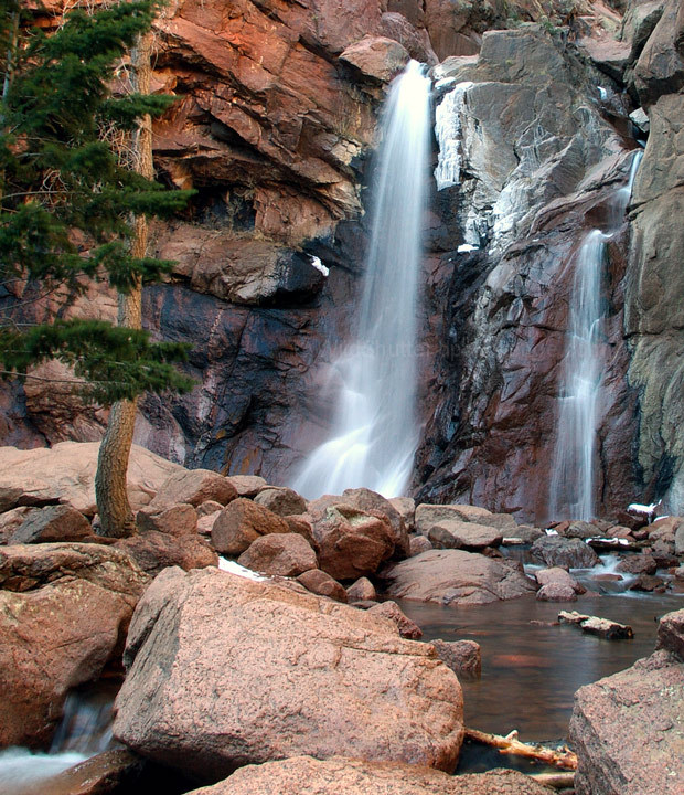
Wow... deja vu... right next to each other on my list are pictures of Dorothy Falls. I'm guess they were taken by two photograpers there at the same time.
Very nice. Excellent control of highlights. I'm starting to like just a bit of blowout in waterfalls (like you have at the top). Colors are nicely done between the reds and grays. I'm mixed about the tree on the far left. 8
This is a great shot. Would have been interesting to see what would happen if the red channel was boosted a bit, and the green channel lessed a bit (to reduce focus on tree branches on the left). Also, I just noticed the tiny waterfall at the bottom-left of the picture...a composition with it more in the picture may have been interesting (I have no idea what else that would have brought into the picture, though).
Very nice progression of colour from the green to the red/orange to the blue/white of the water. A lot to take in, but not so much that it's distracting or confusing. 10.





 Add photograph to your favorites
 Add photographer to your favorites

 Photographer found comment helpful.


