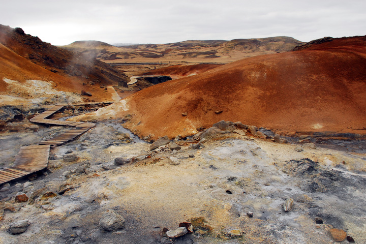
For a moment, I read Ireland, and this didn't quite look like the Ireland they show in the travel brochures... I like the reds and the zigzag of the path.
The foreground color saturation is fine, the sky is quite bland (although there appears to be some decent clouds to work with). I find the walkway on the left the most enticing piece of this composition. Good luck in the challenge.
Delete the title and all you have is a bumpy bit of dirt on a gloomy day ;-) I don't think the tourist board of Iceland would use this location to advertise the nation's natural beauty. Perhaps I am being too cruel or plainly jealous...






 Add photograph to your favorites
 Add photographer to your favorites


