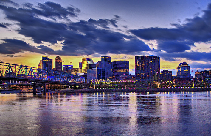
Shot 5 different exposures and combined them in Photomatix Pro. Saved as .tif file and opened in CS2 for editing. Adjusted levels, contrast, brightness, and shadows/highlights. Also toned down the saturation a little and touched the clouds up. Neatimaged, unsharp mask, resized, and save for web.
Statistics
Place: 136 out of 308 Avg (all users): 5.7695 Avg (commenters): 6.2143 Avg (participants): 5.3444 Avg (non-participants): 5.9832 Views since voting: 900 Views during voting: 436 Votes: 269 Comments: 17 Favorites: 0
This image does a great job of capturing the mood of the scene. The predominant blues and yellows go very well together, and combine to produce excellent colour tones and good contrast. Some might not like the blue colour cast apparent in the buildings, but I like how it contrasts with the yellows. You did a good job of merging the 5 shots together, and there are no obvious seams or mask edges anywhere. The water is generally crisp with great reflections. You have proven with this image that you have fairly good post-processing skills.
There are a few primary issues with this image, notwithstanding which it would have scored a good bit higher. First, the clouds are quite blurry from the slow shutter speed and combination of images. These clouds are nice, with good contrast against the sky, and clearer clouds would have resulted in a very crisp shot. Second, there doesn't appear to be much in focus; the distant buildings and the buildings on the right are quite blurry. This might have been fixable with a smaller aperture, but I don't know what your original lighting was like, so that might not have been feasible. Third, many would say this doesn't meet the challenge requirements. Landscapes are natural, whereas almost every aspect of this photo is artificial/man-made. Fourth, the yellow seems to be reflecting off of some surfaces but not others that are at the same angle. This could simply be the scenario, but might indicate a PP error. Whichever one it is, it might have influenced the voting.
Not a bad shot, but you could have scored higher if the image was crisper. Good job.
WOOT!! Thanks for all the comments!! I was kind of expecting a little better score out of this one but once again my lack of experience in post-processing hurt me a bit. At least I have a new image on my profile! :)
Great shot, but not landscape IMHO. Although I don't think it meets the challenge well enough I like the photo very much, the colours, the sky and reflections - and will give it 7.
It's an interesting photograph. Not a big fan of the neon blue look. Maybe crop differently so that the city doesn't run directly through the middle of the shot.
I love the colors. I would have straighened the shore line (perfectly horizontal)...and wish the buildings had a bit more detail (almost look a little blurred). Otherwise, It wouldn't surprise me to see this image published somewhere. Very nice.
Hmm, either the clouds were really moving on a longish exposure, or the processing is a little off at top. If this is an HDR attempt sometimes the clouds can blur like that from exposure to exposure. Is the horizon tilted or is that just illusion from the bridge? 6
Very pretty, but I wish the buildings were less blue. It also seems like the clouds are doubled... HDR I'm guessing. Those darn clouds just won't hold still huh? :) But the "moving" clouds also give an interesting effect. The city is so solid and grounded, yet the clouds give a feeling of flight and movement. Good job!





 Add photograph to your favorites
 Add photographer to your favorites


 Photographer found comment helpful.


