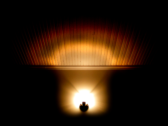
This picture was actually much more "lit" than this, I just went to town on it with the brightness/contrast in Photoshop. I liked the shape/pattern of the original, but when I played with the brightness and contrast I found this mushroom shape that looked pretty cool to me and more interesting. Hopefully its clear enough for everyone else to make out the shape.
With the December rules in mind, I used the clone tool to kill some of the purple fringing I was getting on the edges of the light fixture. There's still some there, but it looks better now. The shot was framed with the bottom of the "mushroom" touching the bottom of the frame, so I moved it up and added a black layer below, then used a feathered eraser brush to clean up the hard line this left at the bottom of the 'shroom. I also took the eraser to the sides of the stem to clean off some of the red fringing. I used the dodge tool on the cap's perimeter to highlight and bring out the shape a bit better.
I think this cuts it pretty close to what people will tolerate with photoshoping here, and if it gets seriously dinged in the comments then I'll know I went too far...
Statistics
Place: 34 out of 125 Avg (all users): 5.9225 Avg (commenters): 8.0000 Avg (participants): 5.8481 Avg (non-participants): 6.0159 Views since voting: 1750 Votes: 142 Comments: 11 Favorites: 2 (view)
To answer a few of your questions, and to be clear, I did not "mold" the shape in PS. In upping the contrast, the shape formed itself. I used the eraser tool to clean off some of the colored fringing around the stem. The dodge tool was used to bring out the colors around the cap. I consider this photo-editing, quite different from digital art. I did not make this mushroom in PS, I brought it out in the image more clearly.
Funnily enough, you weren't the only person to see this as a floor to wall shot. It was actually a wall to ceiling shot. The slats are on the ceiling, the light is a fixture mounted to the wall. I kind of liked the slats as the helped me see the definition of the cap, contrasting it from the stem more. I do see your point about the blown out light - I'm typically a little less concenred about issues like this in photography, but appreciate the comment nonetheless.
I really liked this shot during the challenge, it made me stop and look twice which is always a good thing. Get them to think and look at it again. Reading the description of what you did in the comments I have to wonder just what the original shot looked like and how much PS work you did to it to help create this shape. But from what I see you did more to clean it up than create the shape itself, right?
As for the shot, the light is set up perfectly in the center offering the viewer a starting point but then the light right there is so blown it's a bit distracting in the end. The way it comes across the floor and onto the wall is very flowing and works very well but the slats on the wall are also a bit distracting. Is that a mounted light or could you move it and try it on a solid wall? I like the basebroad across the bottom, it provides the seperation of the stem of the shape to the top of the shape. The coloration and light are very well done.
Good Luck In Future Challenges!
Deannda
DNeufer@stny.rr.com if you have any questions or want to discuss this further!
Great concept, and an interesting shape. I think the slats and molding in the ceiling detracts from the overall effect - it becomes more of a subject than the mushroom shape.
This definitely caught my attention. Great use of lighting to produce abstract piece of art. Love the golden tones and the textured top of the image with soft bottom. Great shot.






 Add photograph to your favorites
 Add photographer to your favorites


 Photographer found comment helpful.


