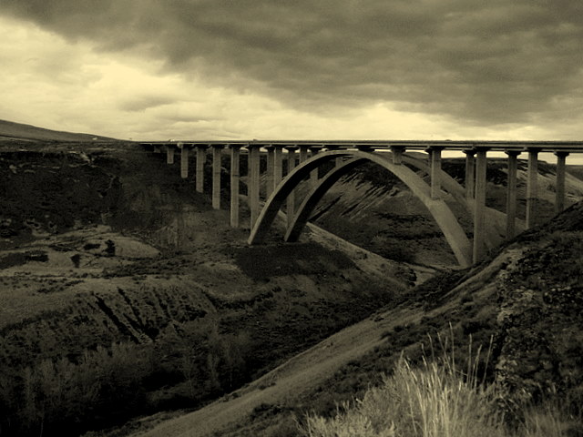
the image should have been taken from a diffrent angle/perspective(SP)
to emphazize the architectural lines. the brigde is broken/cut-off on the right.the grass in foreground is distracting. last i am not fond of prcessing but, that is subjective.
Very nice coloring and contrast. The bridge creates a very strong line, and I get a feeling of how immense it is, and the depth of the valley. I would expect to see this image published, or at least in a fine art gallery.
too dark imho. The only contrast is global, between the sky and the rest of the photo (with the exception of the distracting bush on the bottom). With expert editing, you could have gotten a lot more contrast in the foreground with the bridge itself.





 Add photograph to your favorites
 Add photographer to your favorites

 Photographer found comment helpful.


